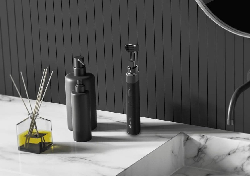
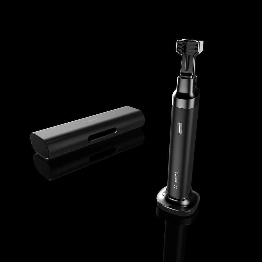
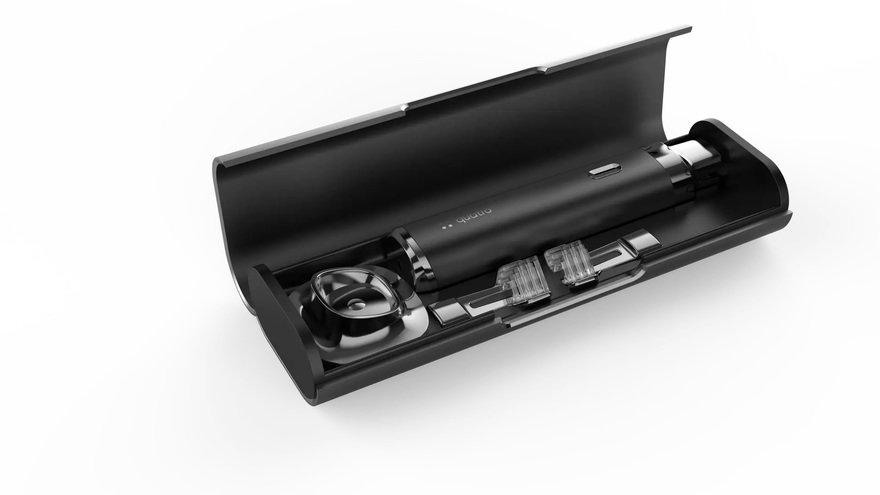
Our collaboration with Quatro on the QuatroBrush identity system began with an in-depth research phase to understand the dental care market and the unique positioning Quatro aimed to achieve. We conducted market analysis, studied consumer behaviors, and delved into dental health trends. This research guided our understanding of the brand's mission and vision, emphasizing the importance of being informative, direct, and empowering people to take charge of their dental health. The values of efficacy, intentionality, honesty, and consciousness were identified and incorporated into the brand identity to resonate with the target audience.
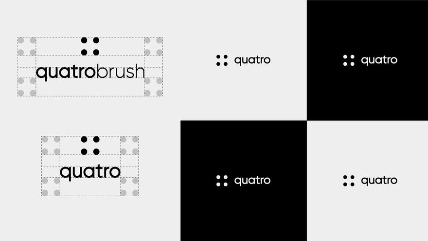
Our strategic approach focused on creating a brand identity system that not only communicates QuatroBrush's mission but also ensures consistency across all touchpoints. The strategy involved developing a comprehensive set of brand guidelines, encompassing the logo, colors, typography, and visual elements. The decision to customize the Gilroy typeface and create a monochromatic color scheme aimed to establish a modern and cohesive brand image. Our strategy also emphasized the importance of whitespace, ensuring a clean and professional presentation of brand elements. We developed multiple versions of the logo, considering different applications such as social media, product branding, and favicon, to maintain versatility while adhering to a unified brand message.
Our design team played a crucial role in shaping the visual identity of QuatroBrush. The customized QuatroBrush logo mark, a modified version of the Gilroy typeface, reflects a modern and unique aesthetic. The design of the logo lock-ups, alternate logos, and product logo followed a meticulous process to ensure versatility and legibility across various mediums. The design strategy also included creating a distinct color hierarchy and guidelines for typography, using the Rubik typeface to convey the brand voice effectively. Each design element was carefully crafted to align with the brand's messaging and values.
The execution phase involved translating the research, strategy, and design into tangible brand assets. We ensured that every aspect of the QuatroBrush identity system adhered to the established guidelines. The execution included creating variations of the logo for different use cases, developing a coherent color scheme, and establishing rules for typography across various applications. The execution also extended to the visual representation of QuatroBrush on social media platforms, ensuring a consistent and engaging brand presence. The final result is a cohesive brand identity system that not only communicates QuatroBrush's mission and values but also provides a versatile and visually appealing foundation for the brand's growth and recognition.


