Will We Have an Iconic Social Distancing Graphic, Like "Rosie the Riveter?" Based on These, Probably Not
Some politicians have likened the COVID-19 pandemic to war. Wars, at least in the 20th Century, produced iconic social messaging graphics like these:


In future decades, will people look back at our social distancing graphics and find one of them iconic? Based on what's out there, I'd say probably not. Here are some quick crits on the latest I've seen:

Basic, job done. But probably not strong enough an image to go down in the history books.


Basic, and these three don't seem to agree on the recommended distance.

Basic with stylish furniture/color pops apparently meant to appeal to co-working Gen Z or Millenials. I suppose it is of the era, if a bit bland.

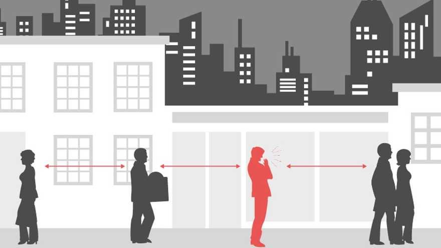
This one doesn't make sense and the illustrator should be let go. By attempting to jazz up the drawing with a cityscape, it suggests we must remain on opposite sides of the street.

If you want to integrate a cityscape, this one's done a better job. Uses the time-tested design rule of red to make something--in this case, a coughing, presumably infected person--stand out.

This one's got to be British (the only folks I know who use metric and Imperial interchangeably). Social justice warriors will find the race roles here too controversial for this one to gain any traction.

I'm not crazy about this one, from the distractingly busy background necessitating the sloppy white outlines of the people, to the virus being depicted as a wispy, wafty cloud, the way scents were depicted in old cartoons. Also took me a second to realize that the floating callout in the middle is not a pepperoni pizza nor a strawberry shortcake, but the virus itself.

Basic and uses the cough/sneeze droplets to graphically illustrate the danger. Effective enough. Though I do think it's a strange choice, that the person being sneezed on is a gender-fluid Dr. Manhattan with hands spread in surprise.
If you've come across a different graphic that you think is strong enough to go down in history, please let us know in the comments.
-
o3Favorite This
-
Q6Comment
K
{Welcome
Create a Core77 Account
Already have an account? Sign In
By creating a Core77 account you confirm that you accept the Terms of Use
K
Reset Password
Please enter your email and we will send an email to reset your password.


Comments
Created two posters: Stay Home and Social Distancing. Let me know what you think!
Use a standard size object that people will recognise.
Good thing nobody in the UK is named "Peter".
This is from dreamstime.com/stop-sign-icon-hand-stock-vector-image129504730, a royalty-free image
Interestingly enough, there's a nonprofit called Amplifier Art that is exploring this too. They've created an open call for artists creating those type of images (full disclosure, I've submitted a design). It's been interesting to see the different takes and approaches: https://community.amplifier.org/campaign/global-open-call-for-art/
"This one's got to be British (the only folks I know who use metric and Imperial interchangeably)"