Bloomberg is a Billionaire Because He Backed Good Design
His "computers for virgins" design approach has made him a rich man

Pop quiz: Who are some famous American billionaires you can think of? My guess is you'd rattle off Buffett, Trump, Musk, Gates, Bezos, Bloomberg.
How'd they make their money?
Bill Gates: Microsoft
Jeff Bezos: Amazon
Elon Musk: Numerous web ventures including PayPal
Donald Trump: Real estate
Warren Buffett: Finance
Michael Bloomberg: Finance
Actually, one of them built a massive fortune by backing good design. That's Michael Bloomberg, and this chapter of his story begins with him being in the wrong place at the right time.
From Working in His Underwear to Getting Fired
With an MBA from Harvard, in 1966 Bloomberg began working at Wall Street investment bank Salomon Brothers. And he started out at the very bottom; while he might have showed up in a suit and tie, the actual work required him to take most of his clothes off.
"We slaved in our underwear, in an un-air-conditioned bank vault, with an occasional six pack of beer to make it more bearable," he wrote in Bloomberg on Bloomberg. "Every afternoon, we counted out billions of dollars of actual bond and stock certificates to be messengered to banks as collateral for overnight loans. By the 1980s such practices would be as quaint as the horse-drawn carriage."
He worked his way up to partner by 1972. In the following years he became a bona fide Wall Street star, "known for coolly risking enormous sums in trades that nearly always proved profitable," according to Encyclopedia.com's citations of articles in Newsweek, New York, and Vanity Fair.
However, due to internal politics, by 1979 he was shunted into an undesirable and unsexy department, in the then-burgeoning field of information technology. While he was "promoted" to Director of Computer Operations, this was a shitty assignment, and a de-facto demotion.

Bloomberg played the hand he was dealt. With an undergraduate degree in Electrical Engineering, Bloomberg knew how to problem-solve, and began identifying problems in the company's computer system that needed fixing.
In 1981, amidst a merger, he was one of a half-dozen people forced out of the company. Finance is a brutal world; the man who had originally hired Bloomberg simply told him "Time for you to leave."
Fixing User-Unfriendly Design
Finance is brutal--but lucrative. Bloomberg had a $10 million golden parachute. He took $4 million of that and plowed it into a start-up, harnessing what he'd learned in the previous years: That computers could be used to rapidly bring relevant information to traders, but that the existing systems were difficult to use and generally sucked.
Working out of a 10x10 rented office, Bloomberg hired four people to help him design and build a computer terminal that would deliver information about the Treasury bond market, and it would be easy to use. (Note that this was a couple of years before Apple came out with the Macintosh.)
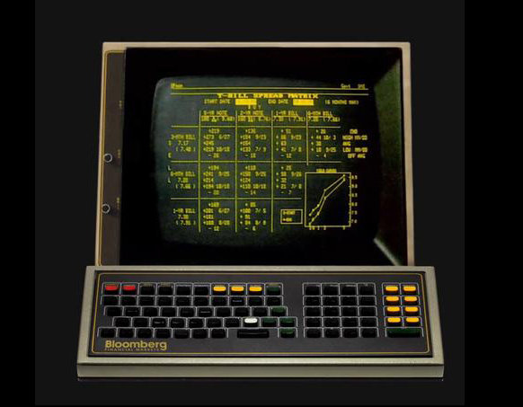
Bloomberg's MarketMaster terminal was born:

In 1982 Merrill Lynch became the first customer, purchasing 22 of them. They also invested $30 million in Bloomberg's new company, Innovative Market Solutions.

In '86 the company name was changed to Bloomberg L.P. In '87 they'd sold 5,000 machines and launched a trading systems platform.
From Rich to Super-Rich
By 1989 Bloomberg's company was worth $2 billion, and he bought Merrill Lynch's 1/3rd share back.
When Bloomberg ran for New York City mayor in 2001, his fortune was estimated at $4 billion. Today, as Intelligencer reports, "According to Forbes magazine estimates, he's the eighth-richest person in America with a net worth of $53.4 billion — making him 17 times wealthier than President Trump. And unlike Trump, he's a self-made billionaire."
How did his wealth increase so rapidly? "A large majority of Bloomberg LP's $10 billion in annual revenue comes from Bloomberg Terminal subscriptions." The Bloomberg Terminal, as it's now called, has an estimated 325,000 subscribers (you now rent them for two years at a time, rather than buying) each paying around $20,000 a year.
Computers for Virgins
What was so innovative about Bloomberg's original design, and how did it manage to endure from 1981 to a still-dominant position today? First off, Bloomberg's approach was what he himself called "Computers for virgins" in his 1997 autobiography. It was meant to be used by people who had zero computer experience.

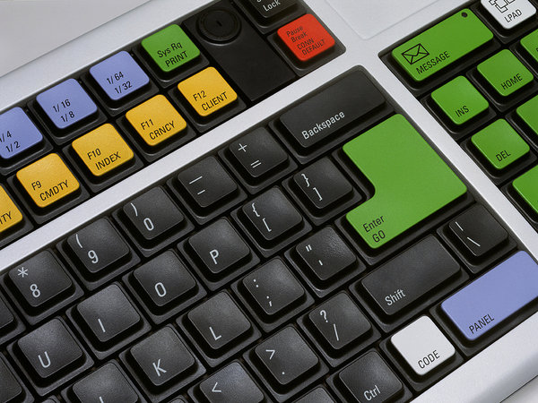
Simple design touches, like replacing the standard "ESC" key with a key labeled "CANCEL" and coloring the button red, clearly communicated to users what it was meant to do. The standard "ENTER" button was changed to "GO," colored green, and placed on the extreme opposite corner of the keyboard, reinforcing that these were completely opposite operations. Yellow buttons on the right brought you to different markets. A unique "MENU" button brought you back to the last menu you accessed. And if you wanted to send a message, you hit a button labeled "MESSAGE."
 Bloomberg's first "Chiclet" keyboard.
Those design touches might not seem like a big deal now, but in 1982 this was a holy-shit level of user-friendliness, compared to what was out there at the time.
In 1986 they came out with a laptop version. This was as crazy and hi-tech appearing as IBM's first laptop, which came out the same year:
 1986
1986
In 1989, the design took a hard left. A trackball was added for speed, and the keys were spread out and re-arranged, as if to prevent accidental button-pushes. Functionality may have improved, but aesthetic considerations were nil.
 1989
1989
By 1992 Bloomberg spotted the need to add multimedia communication. Headphone, telephone and microphone jacks were added, as was a built-in speaker.
 1992
1992
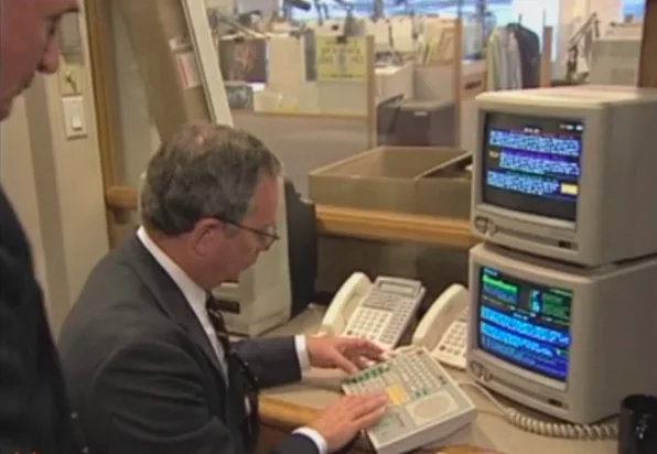
 Bloomberg himself using the Terminal, with flatscreens still a few years away
In 1994, with basic computer literacy now widespread, the designers returned to a more conventional-looking design, while still retaining their color-coding and dedicated-function buttons. The speakers were there--now stereo--as were the mic and headphones jacks from the previous model, but the trackball was ditched.

 1994
1994
In 1995 they came out with a then-hi-tech wireless model, which operated via infrared. For this design the speakers had to be sacrificed, but the trackball returned.
 1995
1995
The 1996 design got rid of the trackball for good, kept the jacks and speakers, and added more trader-specific function keys. Fancy dual flatscreens were added.


 1996
1996
In the mid-2000s the design was stepped up: Antenna Design was hired for the revamp. A biometric fingerprint sensor was added to the keyboard, and the dual screens could perform some fancy tricks.


 Antenna Design, mid-2000s
By 2008, technology had improved to the point that the keyboard's footprint could be greatly reduced, even as it was made wireless. The fingerprint sensor was moved to a more sensible location at the bottom.
 2008
2008
And finally, today's keyboard has perhaps the most rational design of all of them. And the fingerprint sensor has been reduced to a tiny notch, at top right, that you swipe your finger down on.

 Today
Today
Here's a look at what the design team went through to get today's keyboard just right:
It's Not Just a Keyboard from Bloomberg LP on Vimeo.
Lastly I should point out, when I say that Bloomberg backed good design, I don't just mean the design of the keyboard. I mean the design of the entire user experience. We didn't get into any of the technical details of the overall system--how the reliability, information and security of the system is delivered--because that's not our beat. But the way that the entire package of the Bloomberg Terminal seamlessly delivers its results to users is why the machine has been able to fend off competitors and persists with high sales today, nearly 40 years after it first launched. As the Intelligencer article quoted one user,
"The goddamn thing works," says Josh Brown, CEO of Ritholtz Wealth Management and a frequent panelist on CNBC's Halftime Report. "It does what it's supposed to do. It's reliable. They're constantly adding new features."
Brown agreed that it would be possible for many Terminal users to cobble together web services providing the information they truly need for much less than Bloomberg's subscription fee. But he said this approach is less user friendly and less reliable and that users remain willing to pay a high price for the Bloomberg Terminal because of the cost savings they can generate from using it.
For example, he said the Terminal has made it easier for bond investors to trade directly with each other instead of paying fees to brokers. Why scrimp on your Bloomberg subscription when the functionality it offers you may be saving you huge amounts in commissions?

Bloomberg found a lucrative niche where design was lacking, and where he knew plenty of people would be willing to pay handsomely for good design, because it would help them make more money. Like Apple, he controlled both the hardware and the software to tailor the user experience. But unlike Apple, Bloomberg's designers actually listen to their customers, as we saw in the video above, and they design their improvements accordingly.
Their efforts make an incredibly complicated system as easy to use as possible. I wish Bloomberg L.P. could design my health insurance provider's systems.
-
o1Favorite This
-
Q3Comment
K
{Welcome
Create a Core77 Account
Already have an account? Sign In
By creating a Core77 account you confirm that you accept the Terms of Use
K
Reset Password
Please enter your email and we will send an email to reset your password.


Comments
Unless we define "design" as "something, that, after the fact, can be said to have worked," there's no other measure of design that Bloomberg the company is particularly good at.
I have a few issues with the stating he developed anything code-like. He was an IT director therefore he didn't develop any code, so him working out the bugs of the system was a brilliant code monkey doing this work and Bloomberg taking credit for him. Integrity, Subtract 5
Thanks for reminding me of Antenna Design. It was good to look them up and see some of the great work they do: http://www.antennadesign.com