Yea or Nay? Circular and Radial Bar Graphs for Presenting Information
Information designers should be well-rounded. I don't think their charts should be
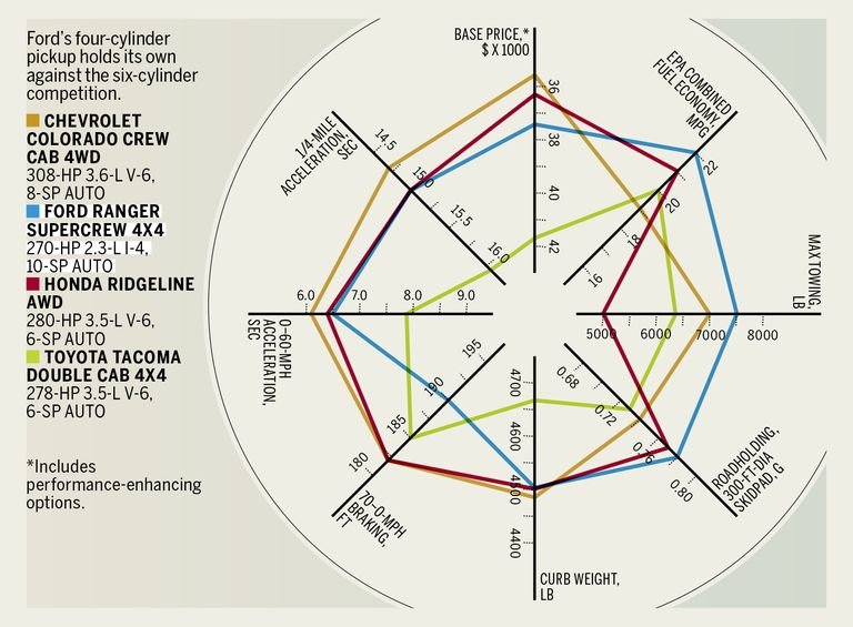
Living on this rural farm, my vehicle situation is opposite from many in the suburbs: I need a truck, but I don't want to get one. Nevertheless I was reading up on the Ford Ranger and its competitors on Car & Driver, when I came across this peculiar take on the bar graph:
 Image credit: Car & Driver
What the hey? I found this circular arrangement chaotic, confusing to read and much harder to get a quick visual sense of comparisons.
After poking around a bit, I couldn't find quite the same style as was in the C&D article, but it does seem a subset of information designers have begun toying with circles. I believe they're doing this out of a desire for novelty rather than an urge to more clearly present information. Take a look at this "dazzling" (those are the creator's words) radial bar chart:
 Image credit: Vizzlo
Or these circular barplots:
 Image credit: Circular Barplots
 Image credit: Circular Barplots
 Image credit: Circular Barplots
And this circular stacked barplot:
 Image credit: Stack Overflow
Even aside from the tiny text, does anybody actually enjoy tilting their heads this way and that? Does anybody actually find these easier to read?
-
oFavorite This
-
Q3Comment
K
{Welcome
Create a Core77 Account
Already have an account? Sign In
By creating a Core77 account you confirm that you accept the Terms of Use
K
Reset Password
Please enter your email and we will send an email to reset your password.


Comments
The subsequent graphs are nothing like the first.
These radar charts are hugely common in the automotive industry; they quickly communicate consistent 'best-in-class' metrics. For example Ford's preference for Fuel Economy at the expense of acceleration.
It looks like it ads more confusion than information. It is a style template in Excel, so it is inevitable that it would be used incorrectly. Typically, a polar chart would be used for information that was cyclic, not categorical. Seasonal variation would be an application where phase information would be the subject of interest. The target audience would have to have the abstract cognitive ability to read a graph. Popular magazines are not trade publications or scientific papers; the creators may not be familiar with Tuft's "The Visual Display of Quantitative Information."