WantedDesign School Workshop 2019 Asked Students to Create Design Interventions Around Brooklyn
Here's a look at the resulting projects!

Every May, WantedDesign presents a unique program, bringing a group of students from international design schools together to participate in the Design Schools Workshop. Conceived as a collaborative activity rather than a competition, teams are composed of students from different schools and backgrounds.


This year, the workshop was led by Academy of Fine Arts in Warsaw faculty members Tomek Rygalik and Jerzy Porebski, and gathered a record of 10 schools—with 45 students participating coming from 7 different countries.
The proposed 2019 theme explored the Open Form theory of Polish architect, theorist and educator Oskar Hansen. The exploration and observation of a 1 mile radius around and including Industry City and the Sunset Park area in Brooklyn was the starting point for the team to elaborate their project.
Participating Schools
Participants included students from Aalto University (Finland), Appalachian University (USA), Art Center, (USA) Centro (Mexico), Ecole Boulle (France), Escuela de Comunicación Monica Herrerra (El Salvador), Pratt Institute (USA), Strate School of Design (France), Tongji University (China), Warsaw Academy of Fine Arts (Poland).
Jury
Allan Chochinov, Partner, Core77; Chair, SVA MFA Products of Design; Jean-Jacques L'Henaff, Vice President Design, Lixil Water Technology Americas , Todd Bracher, Designer and founder Todd Bracher studio, and Ece Calguner Erzan, Skidmore, Owings & Merrill LLP associate director.


Sponsors and Mentors
The event took place with the support of Industry City, French Airline XL Airways, Visual Magnetics, OFS, and FilzFelt. Extra support from the Cultural Services of the French Embassy and its partner FACE (in conjunction with Oui Design ) as well as the Polish Cultural Institute in New York.undefined
THIS IS STAIRS
TEAM: Denisse Carcamo, Escuela de Comunicacion; Monica Herrera, El Salvador; Duncan Bonar, ArtCenter College of Design; Olson van der Vorst, Appalachian State University; Stiina Ruusuvuori, Aalto University; Tianlan Deng, Pratt Institute


Enter a caption (optional)
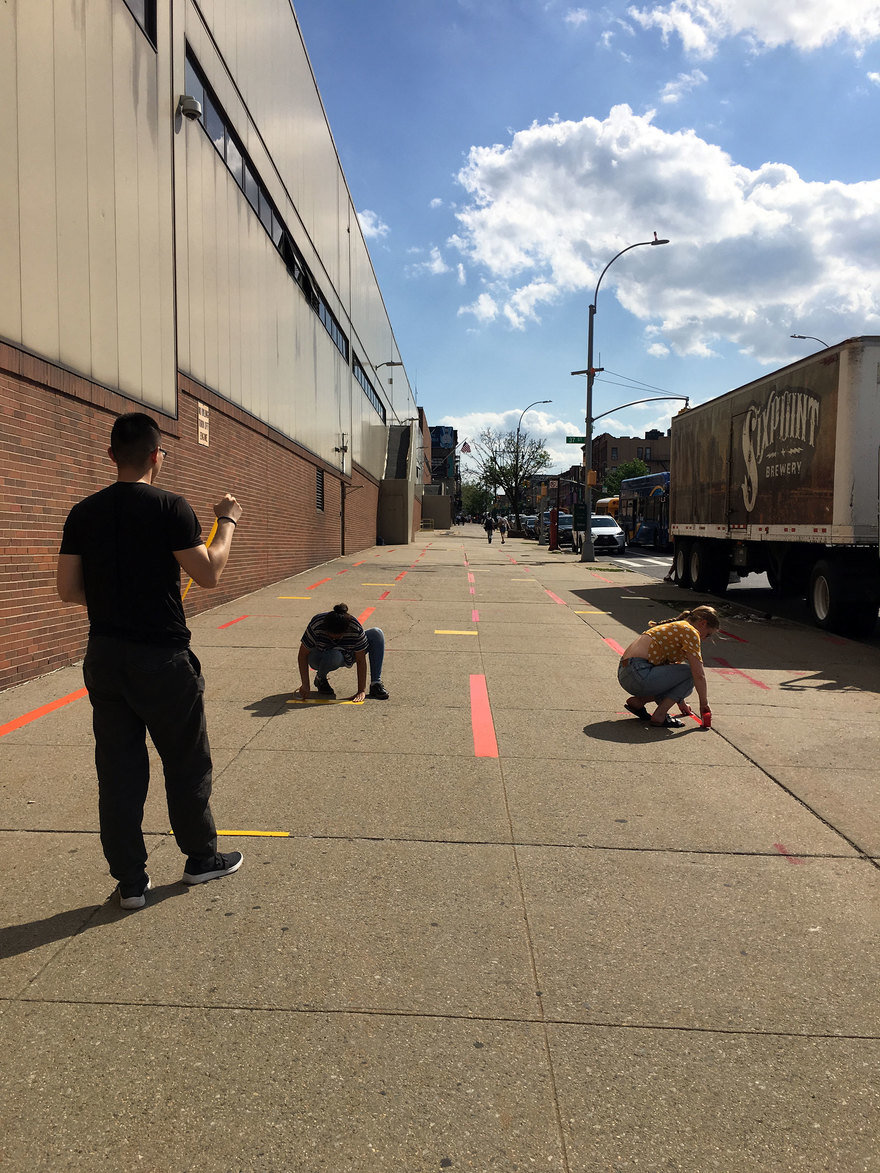
"This Is Stairs isn't actually about stairs at all. It's about a shift in perspective, for the spaces we pass along day after day. Our team was allotted a double wide sidewalk that lived beneath an obtuse state owned transit building. An entire city block of wall and sidewalk, or, as we found, 'a desert to traverse as quickly as possible.' There were two geographic features that stood out to us: the sidewalk itself in its scale, and a brutalist covered staircase that appeared to live on the side of the building.
This space, as empty canvas, provided endless opportunities for design intervention. Yet, what the space was really about was traversing across it. We wanted to provide a choice to play. A distilled maze was our offering, but only articulating the transition points where we would change direction. At no point is the traveler locked in to a maze, but constantly choosing where to go within the constructed transition points—each adhered to the ground itself. The reactions were wonderful, especially from kids—scootering between the lines, walking along the lines, and jumping from space to space, the implementation of play was a great success."


Enter a caption (optional)


Enter a caption (optional)
Island under Construction
TEAM: Lin Elkins, Appalachian State University; Virgile Leclercq, Strate School of Design; Fatima Lopez, Escuela de Comunicación Mónica Herrera; Charlotte Lourme, École Boulle; Carlo Raymann, Aalto University


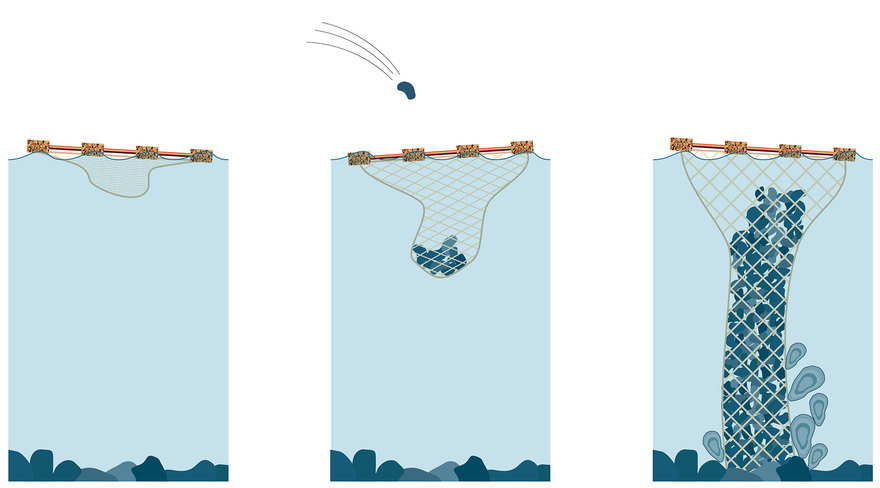
"It is estimated that in the early 1600's, New York waters contained half of the world's oyster population. As the city expanded, many of the buildings depended on the burning of oyster shells for lime. But by 1910, oyster bed populations were declining rapidly due to increased overfishing and water pollution. Oysters are not only important to maintain a balance within the ocean's ecosystem, but they also absorb up to 93% of incoming storm surge power during hurricanes.
Our intervention takes place near an oyster rehabilitation project area, and aims to raise awareness on the ongoing project and the importance of preserving biodiversity. We noticed numerous people and especially children throwing rocks in the water, so we created floating targets attached to a sinking net that collects rocks. This installation has two key positive effects on the site's environment: First, inviting people to throw rocks inside the target avoids damaging the growing oysters around it. Second, once the rock stack is high enough, it creates a welcoming home for oysters to grow on. This allows visitors and members of the community to give back to the environment their predecessors destroyed, and as a result, regrow the oyster reef that protects the land."


Sighthub
TEAM: Wiktor Szulfer, Warsaw Academy of Fine Arts; Diego Ciudad-Real, Escuela de Comunicación Mónica Herrera; Will Sossou, École Boulle; Irina Chou, ArtCenter College of Design; Andrea Justo, Centro


"The streets of New York are full of signs, people, traffic, shops, and more. Due to this form of visual pollution, inhabitants often pass by without perceiving the environment that surrounds them—leaving many things unseen.This is true for the inhabitants of Sunset Park in Brooklyn, especially for young students of Sunset Park High School. After school, they walk through this area, perhaps unaware of their community surroundings. The area we chose was an island on 4th Ave and between 35th and 36th streets. This area is only used as a pedestrian crossing—leaving the center unused—as people only walk across the ends.
Our team wanted to make people stop for a while, observe, and for just a moment in their busy day, appreciate their surroundings. When we talked to residents, local vendors, and students, they told us that, in fact, the space was only used to go to the other side of the street. With Sighthub, our goal is to bring a sense of discovery into the place, pulling people from their phones and taking a closer, more focused look at their surroundings. In order to create a playful,discoverable interaction platform, we envisioned our island to be filled with colorful "lenses," inviting each of the pedestrians to find their own unexpected focus of detail in their busy neighborhood. Each of these lenses allows viewers to see from different heights, making it an inclusive space to playfully explore the nearby area."


SVAP
TEAM: Alexa Pérez, Centro Méxio; Anna Jurgielewicz, Warsaw Academy of Fine Arts; Hanna Niskanen, Aalto University; María Luisa Cañas, Escuela de Comunicación Mónica Herrera; Sky Coppenrath, Art Center


"Our project was located at a Laundromat in Industry City. According to one employee, the average time a person takes to do their laundry is one-and-a-half hours. During that time, most people are on their phones, or leave and return to pick up their clothes. Often clients bring their children—specially on weekends—which are the busiest days of the wee. Employees and most clients around this area are members of the Latin community. After talking to one of the clients, she told us that her children play along with other kids in the gap of time while clothes are being washed. We also learned that in Latin cultures, parents exchange or give away their kid's clothes to younger siblings, cousins or friends' children. Since the Laundromat is surrounded by Latin customers and it is common for them to bring their kids in, the idea of using design to facilitate clothes swapping between families made a lot of sense to us.
Inside the laundromat there's not much space available to start a clothes swap. So we utilized the railing outside the business as an extension of space for swapping to happen. Here, we designed a product that acts as an extension of the railing, creating available space outside the business so customers can swap comfortably. Graphically, the product can symbolize or represent the act of swapping clothes, inviting people to start an interaction, and encouraging a sustainable behavior from the surrounding community.


EYE LINE
TEAM: Elsa Lagunas, Strate Ecole de Design; Morgane Liger, Ecole Boulle; GiGi Nieson, Pratt Institute; Robert Brown, Appalachian State; Balloon, Tongi University


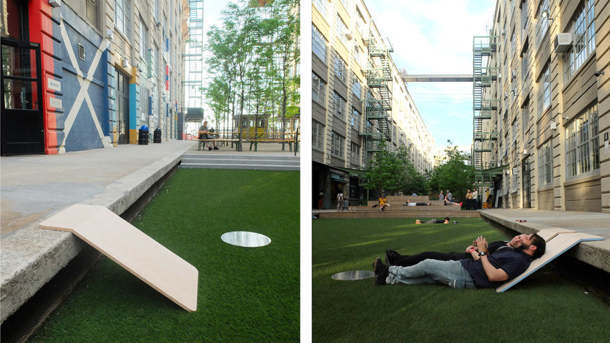
"The space we were assigned was a courtyard within Industry City. The space was already fairly well-designed, and consisted of four major sections: the entrance, the lawn, the garden, and the end of the courtyard. When looking at the area, we decided to focus on the lawn because it was the most open part of the space and had the most room for improvement. The courtyard was designed in a way that kept the viewer focused on the space at eye level, but the first thing that our team noticed was that the buildings surrounding the courtyard framed the sky in a very beautiful way.
We wanted to create something that would cause the user to pause in the space, and to focus on the beauty in nature. Our project, Eye Line, consists of a lounge that rests up against the edge of the lawn, and "sky puddle" that reflects the sky onto the ground. We kept the design simple so that users could move and stack the lounges to get them out of the way, or to spread them out on a nice day to enjoy the outdoors. The sky puddles would attract users into the space, helping them to relax and gazing up/down to the sky!


LINK TRACE
TEAM: Arlene Zhang, Tongji University; Dohyun Kim, ArtCenter; Etienne Lemiere, Boulle School; Léopoldine Garnier, Strate School of Design; Roxanne Yeroham Anav, Universidad Centro


"Our team noticed the huge amount of scaffolding in Brooklyn. Brooklyn is developing quickly, where many of the buildings and environments of the past are being destroyed. Our long-term goal was to preserve the past. Tomek had remarked that "public space is a cultural space recording the past and creating the future," and as a team we thought that scaffolding perfectly represented "work in progress." It also upholds the meaning of past, present and future.
Our project, LINKTRACE, consists of a white cubical portal with a hashtag: #LINKTRACE embed into the scaffolding. Here, people take photos of themselves in the spot over time—creating a digital archive, the traces—through the Instagram platform. The portal links the past, the present, and the future, painted white to represent a blank piece of paper not yet touched. Our group was excited about the idea of creating an archive that would be live on forever—despite development and the changes to the city."


STRING-ERS
TEAM: Valeria Dueñes, Centro ; Erin Loffer, Pratt; Rebeca García, Centro; Julien Pichot, École Boulle; Wu Ningxin, Tongj


"Our group wondered why people often care more about the final destination, rather than the path they take to get there. Our space was a long, abandoned walk towards the pier—only used on sunny days, or by runners and cyclists. As a team, we saw an opportunity to create 'a romantic introduction' for the community, helping them to create a place that promotes physical and mental well being.
The design intervention takes place on the fences along both sides of the road. It uses only two elements: strings and plants. the strings draw out abstract forms, referencing the graphic vernacular of Brooklyn's graffiti and street art. For the vegetation, we chose native species, intending to plant them at the edge of the road, near to the string, so that the vines would grow along the drawn lines. For this project, we saw two important variables: community and time. The community would be able to add strings during certain events, such as "I love my park day"—promoting cooperation and creativity between residents. The other variable is time of course, as plants have seasons for blooming and growing. We were excited about this intervention as a beautiful incentive for people to walk this five-minute road—every time becoming a different space, a different introduction of color through the seasons.
<iframe width="560" height="315" src="https://www.youtube.com/watch?v=pVKPMHGGxIo&feature=youtu.be" frameborder="0" allow="accelerometer; autoplay; encrypted-media; gyroscope; picture-in-picture" allowfullscreen></iframe>
<iframe width="560" height="315" src="https://www.youtube.com/embed/2YhfRkyprXk" frameborder="0" allow="accelerometer; autoplay; encrypted-media; gyroscope; picture-in-picture" allowfullscreen></iframe>


Restful Play
TEAM: Emma Wingerd, Appalachian State University; Quin Boucher, Pratt Institute; Vanessa Durán, Escuela de Comunicación Mónica Herrera; Tzu-Jung Lee, Tongji University; Szymon Zakrzewski, Warsaw Academy of Fine Arts


"While observing the pick-up routine at Primary School 24 in Brooklyn, our group noticed distinct opportunities to foster how parents and kids interact with each other and their environment. A key feature of the school was a fence that surrounded the building, play area, and courtyard. We saw this underutilized element as the perfect starting point for building meaningful connection points for rest, play, and conversation.
Our final product combined three connection points: a counter, a bench, and an interactive toy. The L-shaped counter around a low corner of the fence used principles of proxemics—human space dynamics—that encourage parents to engage in conversation. Meanwhile, a bench improved the pre-existing location where parents would attempt to sit on a small concrete ledge to rest their legs. By establishing a sitting place, we were able to open more opportunities for community connection. Finally, we encourage children to interact with their environment by incorporating a kinetic toy in the negative space of the fence. These three connection points are tied together through consistency of form and color, as well as the invitation to interact with each other and the surroundings in a novel way."


The Origin Tree
TEAM: Valentina Galindo, Appalachian State University; Candice Mouterde, Strate School of Design; Judyta Baczkowska, Pratt Institute; Ola Jankowska, Academy of Fine Arts; Sara Urbanski, Aalto University


"The assigned space for the project was a little side extension of a sidewalk with a tree in the middle located in Industry City. Around the space there is a playground, an elementary school, a church, and an expressway. Overall, the space has a lot of movement, yet is largely ignored. According to an employee of the school, parents wait around in this space for their kids to get out of school. After observation, we noticed that the area was very separated, and could be used as a meeting point to create a larger community.
The inspiration of the design was based on community and how to create simple interaction for all people of all ages. Knowing that most people living in this community are of Latino culture, most of the data would be collected from Central and South America. Our design was based around where people came from. Using the tree, that adds life and organic shape to the space, and the fence that really encloses the space, we created the "Origin Tree" to collect data. We added different color, size, and length rope to the tree and added the continents of the world on the fence. People would come to the tree intrigued and take some rope and tie it to the section of the fence of where they are from, while this is happening people can ask others of where they are from. Even if it's just asking a question, having a full conversation, or actually becoming friends, this gives people some security that they are not alone and can come together to create a new community or add to their community."


-
oFavorite This
-
QComment
K
{Welcome
Create a Core77 Account
Already have an account? Sign In
By creating a Core77 account you confirm that you accept the Terms of Use
K
Reset Password
Please enter your email and we will send an email to reset your password.


