A Designer Buying a Car, Part 4: Subaru Forester, Aesthetics and Practical Considerations
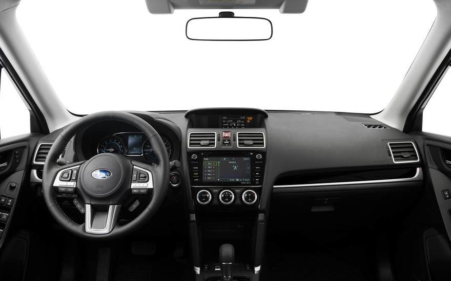
In contrast to the Mini Clubman, the interior of Subaru's Forester looks sober and utilitarian. Nothing here screams for your attention, which is what I prefer.
 Enter a caption (optional)
 Enter a caption (optional)
 Enter a caption (optional)
However, the exterior loses me right away.
 Enter a caption (optional)
The designers have repeated the sin committed by everyone producing a crossover these days, which is to introduce an arbitrary angle into the rearmost side window to make it "interesting."
 Enter a caption (optional)
In this case it's a jump ramp at the end of the beltline. This interrupts and ruins what should be the longest and most eye-pleasing line of the car.
 Enter a caption (optional)
 Enter a caption (optional)
The designers' lack of restraint can also be seen in the headlights, taillights and even rearview mirror. It's as if nothing is permitted to have a clean, honest shape, but must at all costs be interrupted by random angles, notches and half-hearted curves.
 Enter a caption (optional)
 Enter a caption (optional)
 Enter a caption (optional)
The surface changes across the hood are distressing. It's as if someone asked "Should the hood be concave or convex?" and the designers screamed "BOTH!"
 Enter a caption (optional)
Here's a fine example of visual chaos where none of the lines relate to each other.
 Enter a caption (optional)
Let's extend them and see how they intersect:
 Enter a caption (optional)
It's busy, random and distracting. The car practically looks like it was designed during a game of "Exquisite Corpse."
Subaru probably can't be beat for practicality. The company has a great reputation for reliability and AWD prowess. Two friends of mine are part of Subaru's cult following and rave about how fantastic the cars are to drive and how hardy they are. But there's just no way I could own a car that looked like this.
____________
Up Next: The Volkswagen Golf Alltrack
-
oFavorite This
-
Q17Comment
K
{Welcome
Create a Core77 Account
Already have an account? Sign In
By creating a Core77 account you confirm that you accept the Terms of Use
K
Reset Password
Please enter your email and we will send an email to reset your password.

Comments
I cleaned up the lines a bit in photoshop. It looks much better now.
cleaner now?
Soooo much better!
In the spirit of casual design banter, and curiosity, does it help if the lines were drawn like this?
...Eureka!
You almost made me spit my drink out! I owe you a beer.
Is it more expensive to produce beautiful cars? why are there so many that are objectively ugly or hard to look at? Are these designs approved simply because they need a new car every year?
I'm curious to hear your thoughts on the Mazda CX-5. I quite like the lines.
THANK YOU! ...For succinctly expressing my exact thoughts on an admittedly well engineered car.
A little cleaner....
The recent Foresters are awfully disappointing compared to the older models. They've gone from a simple station wagon and small truck had a baby design, to super generic modern crossover with nothing distinguishing about it.
Nice observations in your post. Cars are always great references on how to maintain a brand essence within its form. It is all about image, personality and sometimes function too (although I believe is more form and emotion than function).
Thanks for this series. I'm really interested where you land with all of this. I'd like to see a Dieter Rams car design.
I had no problem with earlier Subaru models that just lacked design. It was an honest decision to focus on mechanical and practical efficiency. I liked them for being ugly. As a graphic designer I loved it. Over the years they showed some interesting concept cars that didn't influence at all their production though. The problem started when they started TRYING to design and managed to over and underdesign at the same time! I m still a subie fan though, still having my old forester sg. My daily commute though is a fiat 500 (makes my day, love it). I can't stand my wife's mini countryman though. Worst ergonomics I ever encountered in a car, I have to focus to use any button!
I was walking around my neighborhood in Brooklyn one night and started noticing the weird hindquarters that a few different model years of the CR-V has. There's what I think is the oldest one, which was by far the worst, with crazily different roof, taillight and window lines. The newest one is more logical but pretty complicated. There were a couple golden years where the lines were all clean and simple. I did a similar comparison on my instagram, pinned at the top if you want to see these (@smcaruso).
As I recall, a kind of "jump ramp" has been at the rear end of the belt line on the Forester for several years
I had the same complaint about the Forester, though you've understood it more deeply, and described it more eloquently. I have owned a number of Subarus over the years, and they are extremely practical. The current line just seems weird and soul-less though - they've always been a bit homely, but with a practical elegance - the new ones seem distracted and jarring. It is a frustrating place to be in, because from a practical perspective they check all the boxes - they just don't make me "want" them.