
Three Key Trends Spotted at Sight Unseen OFFSITE 2017
Notes from one of New York's most innovative and forward-thinking design shows
Set up as a gallery exhibition on the ground floor of 100 Avenue of the Americas in SoHo, Sight Unseen Offsite showcased some of the most innovative designers working today. Unlike other NYCxDesign shows, the editors of Sight Unseen almost dictatorially command who gets to participate or not. The result is a focused presentation of the best new design talent. Here are the three key themes observed at this year's show:
Everything Circular
Stark rendering-like shapes and colors were accompanied with all things round and rounded. Anything one could imagine to bend, did end up bent. Round lights, round mirrors, round tables with round cutouts, round vases, round stools—a most condensed celebration of roundness.
 Mirrors and tables by Slash Objects
 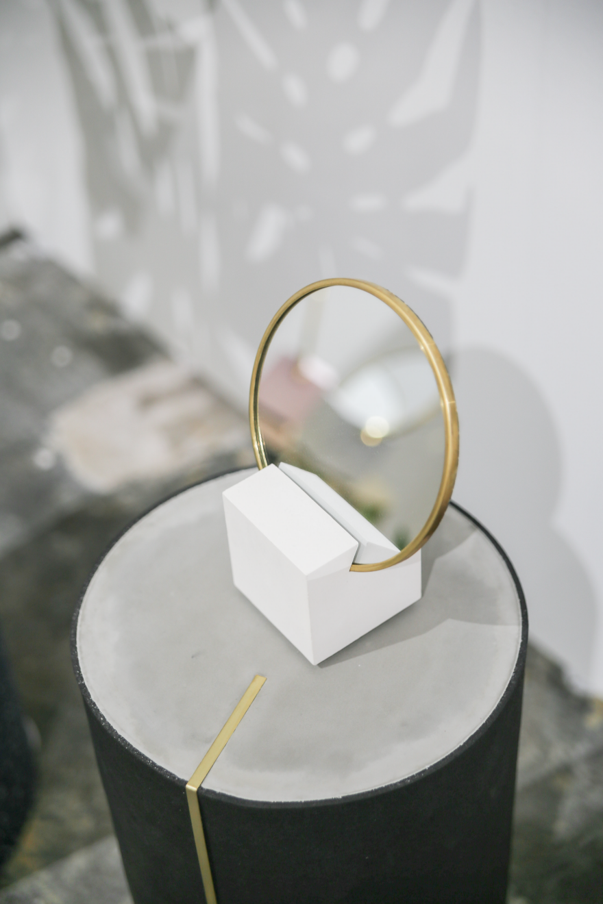 Mirror by Slash Objects
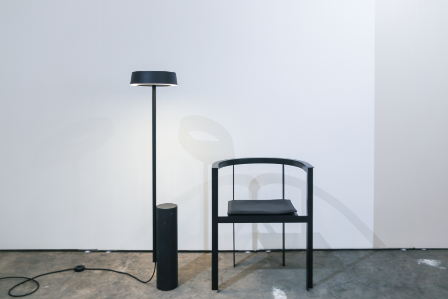 Lamp and chair by New Tendency
  Display by Norway x New York
  Lighting by Grain
 Lighting by Home Studios
 Side tables by Norway x New York
  Lighting by Crosby Studios
 Lighting by Iacoli & McAllister
  Light box by Atelier de Troupe
 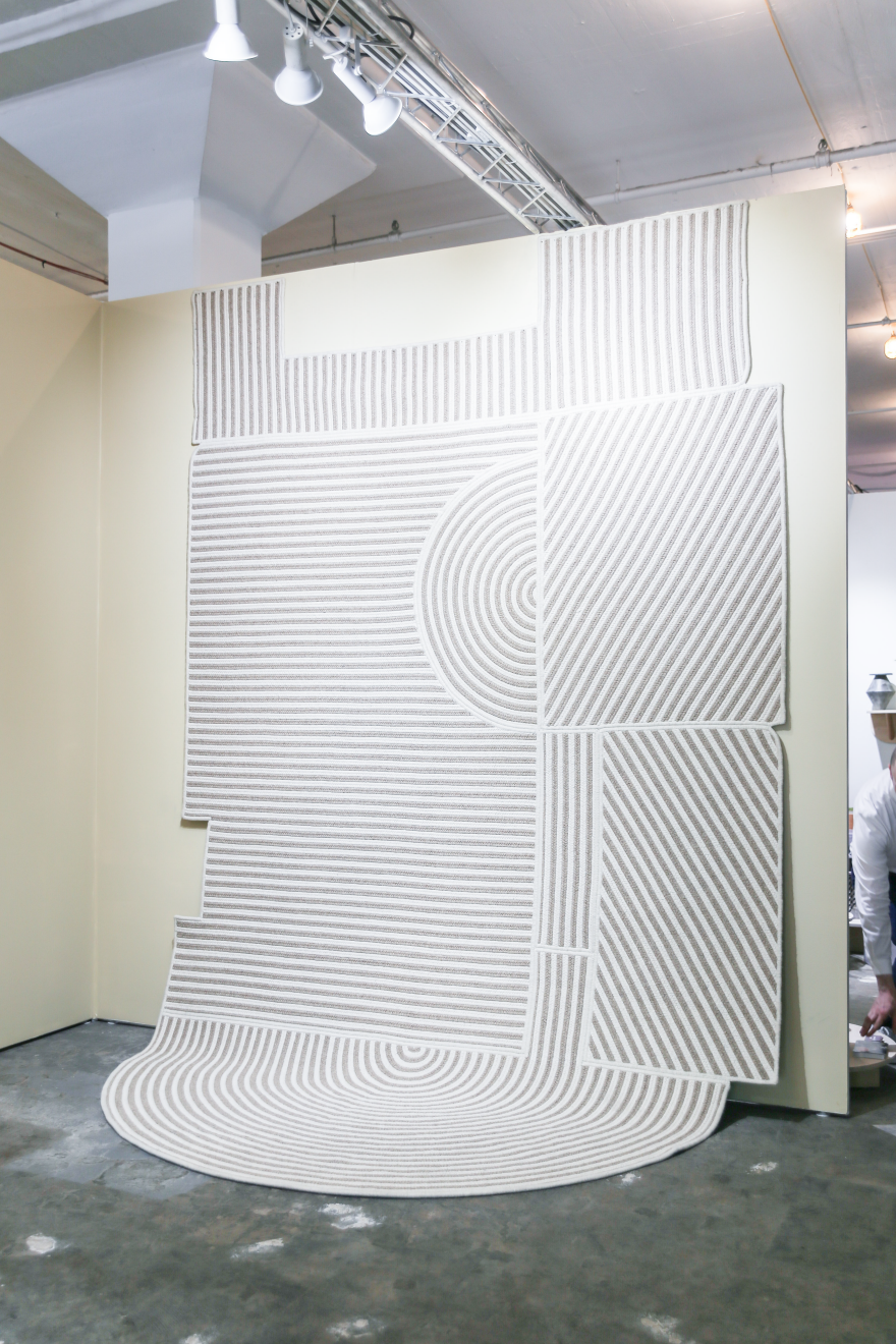 Wallpaper/Carpet by Grain
Clash of Material
Combining materials contrasting in color and texture is a common design approach. At Sight Unseen OFFSITE, the combinations bordered on stark, unexpected and almost uncomfortable—though infinitely novel.
 Chair by Nun x Office GA
 Stools by Areti
  Tall table by Slash Objects
  Table by Eny Lee Parker
 Table by Eny Lee Parker (detail)
 Mirrors by Another Human
  End table by Simon Johns
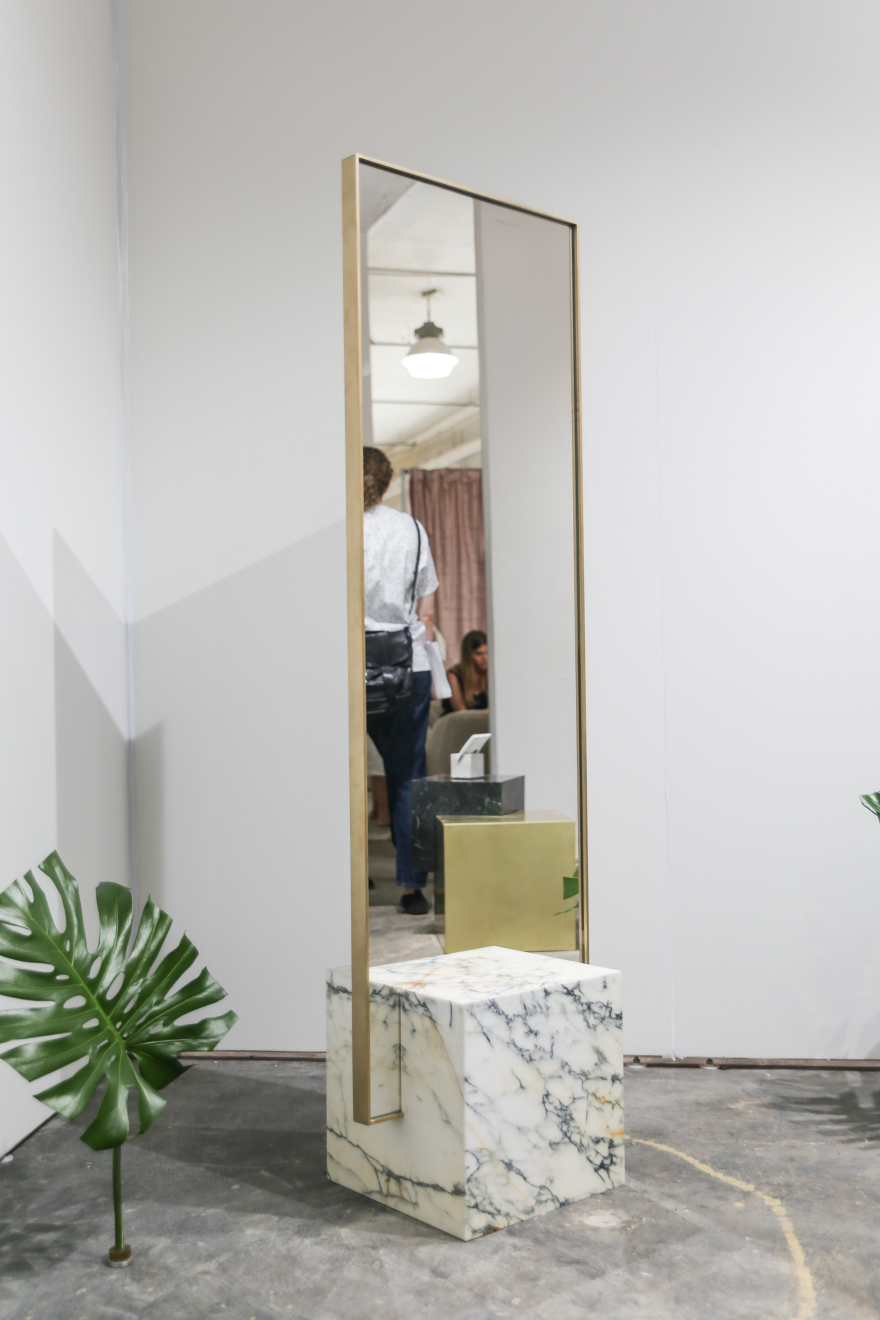 Mirror by Slash Objects
Mind Games
In a way of playing tricks with perception, designers tried to amuse the eye by moving the unmovable, bending the unbendable and turning the unturnable.
 Object by Atelier de Troupe
  Rotating Shelving by Crosby Studios
 Lighting by Ben & Aja Blanc
  Side table, lamp and chairs by Eny Lee Parker
 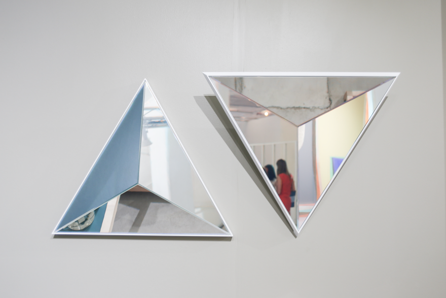 Mirrors by Robert Sukrachand
Want to see more NYCxDesign events worth attending? Visit our Core77 "Navigating New York Design Week" Map
-
o1Favorite This
-
Q2Comment
K
{Welcome
Create a Core77 Account
Already have an account? Sign In
By creating a Core77 account you confirm that you accept the Terms of Use
K
Reset Password
Please enter your email and we will send an email to reset your password.


Comments
Yes, revisiting postmodernism, a bit of 1930's and mid century modern thrown in. But more strikingly it is like Salone and Salone Satellite ala 2013-2015... but really left behind.
Does anyone else feel like this is all just a revisiting of Post Modern design? I have still yet to understand what positive influence or purpose any design in that category has had? (Besides providing an excellent demonstration of art over function.)