Rain's Weekly Design Minutiae: Always Look at the Undersides of Tables
You can learn stuff down on your hands and knees
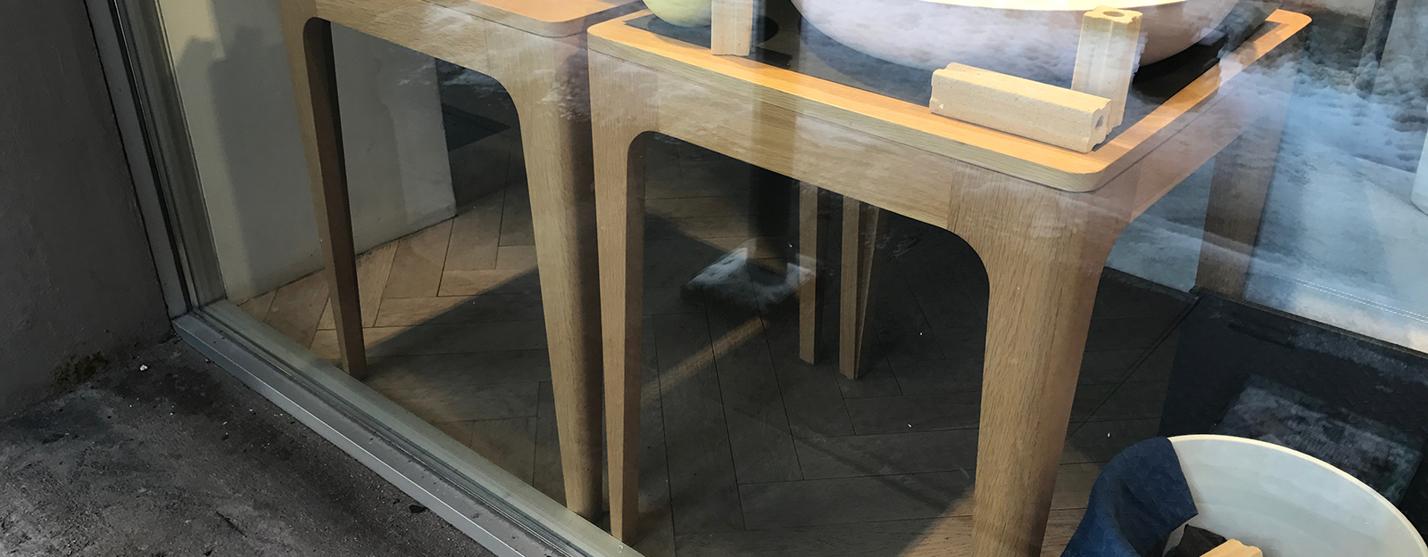
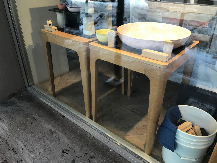
On a late-night dogwalk I passed these display tables in the window of a store on Crosby Street.
 Enter a caption (optional)
I was struck by the unusual design of the legs, which flare out in both the X- and Y-axes to meet the apron:
 Enter a caption (optional)
Surface B wraps around to blend into surface C, as shown in the crude sketch below, which was what I envisioned in my head as I was looking at the table.
 Enter a caption (optional)
There's two sketches because I wasn't sure what surface A would look like if the top were removed. To find out, I crouched down to get a look from underneath and found a couple of surprises:
 Enter a caption (optional)
Surprise #1. The plywood corner braces. No metal hardware here, just simple strips and triangles. You can see the dots where they've been attached with a pin nailer. I expected something more elegant, so here was a reminder that if the customer's never gonna see it, it doesn't matter what they look like.
 Enter a caption (optional)
Surprise #2. The center support appears to be solid wood. (You can see edge grain and I doubt they veneered it.) Given that this part will never be seen, I'm surprised they didn't use less expensive plywood. While a single piece of 3/4" plywood might sag over the span, I think if they doubled it up it would do fine. There must be some production reason why it was more economical to use solid wood.
 Enter a caption (optional)
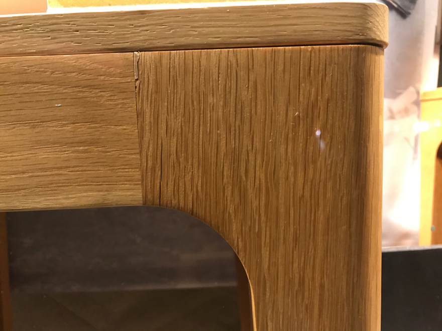
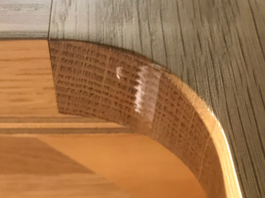
Surprise #3: Now that I could see that the legs are actually shaped like sketch 2 above, it surprised me to see that they were actually one piece of solid wood, not some composite pieces that had been veneered. The telltale is the change in grain on sides of the legs perpendicular to each other. In the image below, you can see it's going from face grain on surface D to edge grain on surface E. (It was quite dark so I've lightened the photos artificially in an effort to reveal detail, sorry for the poor quality.)
 Enter a caption (optional)
 Enter a caption (optional)
By crouching down a bit more I found the true giveaway that these legs were solid wood: At the undercut, you can see endgrain.
 Enter a caption (optional)
 Enter a caption (optional)
Now I corrected myself: There's no way that these legs would be fabricated from a single piece of stock, as in sketch #2 above. To remove that much material, in that cleft on the inside of the legs, would be inefficient. So I looked for some proof that they were made in some other way, and I found it here:
 Enter a caption (optional)
Now you can see a very faint line bisecting the leg:
 Enter a caption (optional)
 Enter a caption (optional)
In other words each leg is made from two pieces of stock, an X-axis side and a Y-axis side, mitered lengthwise at a 45-degree angle and then joined at the miter (the dotted line in the sketch below).
 Enter a caption (optional)
That makes much more sense.
In any case, the store is the New York outpost for Mud, an Australian handmade ceramics brand started by designer Shelley Simpson. I did a little research on them and they have stores all around the world, and for their displays they all use the Vitsoe 606 Universal Shelving System designed by Dieter Rams. In other words Simpson or whoever designed the store has a taste for high design.
The tables in question, different sizes but all the same design, show up in photos of other Mud stores around the world...
 Enter a caption (optional)
...but I was unable to determine who the designer is. If anyone knows, please do comment.
[Update: Special thanks to Sarah, who has revealed that these are the Home Table by Barber & Ogersby. We subsequently wrote about the table here.]
If you live in New York and want to check the tables out, the store is on Crosby between Prince and Spring.
 Enter a caption (optional)
-
o1Favorite This
-
Q9Comment
K
{Welcome
Create a Core77 Account
Already have an account? Sign In
By creating a Core77 account you confirm that you accept the Terms of Use
K
Reset Password
Please enter your email and we will send an email to reset your password.

Comments
That awkward moment when the display furniture is more interesting than the product displayed on it...
The corner braces could be modifications by the retailers to withstand the wear and tear in the retail environment
Good work, detective!
Nice article, love the design of the table, although its a shame about the clunky corner bracing with a bit more refinement the underside could be as beautiful as the top side.
Or they could perhaps be Ebbe Gehl who has a whole range of this design: https://www.johnlewis.com/ebbe-gehl-for-john-lewis-mira-4-8-seater-extending-dining-table/p1569360
The Ebbe Gehl tables are a nice lower-cost version, but these tables are definitely the Barber & Osgerby Home Tables. DesignOffice, who consulted for Mud Australia's retail spaces list the Home Tables on their portfolio page for the Melbourne retail space (see here: http://designoffice.com.au/portfolio/mud-australia-melbourne/)
If I'm correct, these are the Home Tables by Barber & Osgerby. :) Aren't they lovely?
Thanks Sarah, you nailed it! Now updating the post.
I used to work on Crosby and, for years, I'd marvel at that those tables. I have yet to find the designer.