Time Management Tools: Weekly Planners
Designs that go beyond the basics
We're approaching the time of year when end users start selecting their calendars or planners for the next year. Last October, I noted some calendar/planner design features and trade-offs; this year, I'd like to focus on some of the more interesting desktop planner and calendar designs I've seen. Many of these have special sections at the beginning or the end, but I'll be focusing on the main weekly pages.
 Enter a caption (optional)
The Eight Days a Week planners (and planner pads) from Bob's Your Uncle are pretty standard, except they provide a column for things to be done "someday" rather than on any specific day. That allows end users to remember everything they want to do in a week without forcing them to select specific time spots which might well wind up changing.
 Enter a caption (optional)
The Passion Planner provides space for to-do lists, too, splitting them between personal and work. It also has a place to note the current week's focus and "good things that happened." That's going to be useful to end users who tend to get off track or discouraged.
 Enter a caption (optional)
Other planners go further in encouraging end users to be thoughtful about their time management. The Action Day planner has a section for the week's tasks—but it also has sections for delegation/teamwork and goals/projects. This is a planner geared to end users working a normal Monday-Friday schedule; the sections for the weekend days are much smaller than those for the weekdays, and there's no time for anything past 8 p.m.
 Enter a caption (optional)
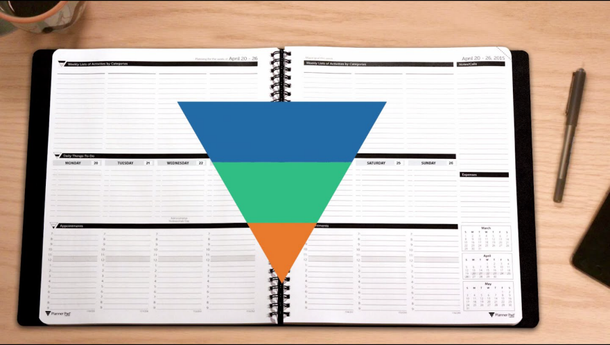
Planner Pads require the end users to think about their priorities every week. Each weekly page starts with a comprehensive list of upcoming activities by category which then get funneled into daily tasks and then into specific blocks of time (along with any scheduled appointments). This will be total overkill for many end users, and it won't work well for those with dynamic schedules where priorities change all the time. But others will appreciate the structured planning approach.
 Enter a caption (optional)
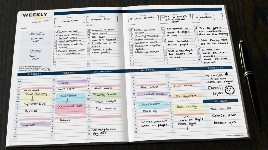
Top Down planners seem somewhat similar to Planner Pads at first glance, just with one less level of planning. But the Top Down planner actually takes a different approach, where the top section defines weekly goals and associated to-do items (which get checked off) and the bottom section keeps track of appointments or time blocked out for specific activities. The two sections aren't as tightly linked as the three sections in the Planner Pads, and there's more flexibility as to when in the week each to-do gets done.
This would be a good planner for end users with long to-do lists each week; seeing the lists in one place along with the calendar might help with setting realistic goals.
 Enter a caption (optional)
 Enter a caption (optional)
The WeekDate planner is designed for end users with repeating weekly or monthly appointments (meetings, classes, etc.) who would prefer not to have to write the same things in their planners over and over again. It folds up into a compact size, but has sections that fold out to show monthly and weekly items. In the center the end user can see two weeks at a time, color coded by week so "second Tuesday" items and such don't get overlooked.
While this approach does save writing the repeating items (and perhaps forgetting some in the process), it also requires the end users to look in three places to be sure they know everything scheduled for a specific day. That will be too confusing for some.
 Enter a caption (optional)
Other planners are designed for a specific set of users. I'm not left-handed, but purchasers who are seem to appreciate the The Left-Hander's Weekly Planner Calendar.
 Enter a caption (optional)
There are a number of planners designed for families, with blocks for writing in each family member's schedule as well as family activities. Most of these planners are targeted at mothers, and they tend to be extremely cutesy; the ones from Plum Paper Designs are a nice exception. The labeling of the individual blocks is customized to whatever the purchaser requests. This type of planner could also be used in a work environment to keep track of a small team.
 Enter a caption (optional)
 Enter a caption (optional)
 Enter a caption (optional)
DAYZ, from LESS THINGZ, is made from high-quality paper folded into a zig-zag accordion. It's appealing in that end users can readily take it along in a bag—but it can also stand open on the desk, keeping appointments visible. (It can also be unfolded to hang on the wall.) It won't work for someone with numerous daily appointments or large handwriting, though. And I've got to wonder how well it would hold up to continual folding and unfolding.
-
o1Favorite This
-
Q2Comment
K
{Welcome
Create a Core77 Account
Already have an account? Sign In
By creating a Core77 account you confirm that you accept the Terms of Use
K
Reset Password
Please enter your email and we will send an email to reset your password.


Comments
Hi Jeri, I am happy and honored we made it to your List. Some of your many readers flocked over to our shop to order the DAYZ planners and NOTEZ Notebooks. Thanks for your feedback and thoughts on the planner: The space to write was a user request, we got from people that liked the concept, and had too many appointments to note. So recently we cam up with two new layouts each featuring double the writing space. Now there are three layouts to choose from. And yes, the paper is holding up well against heavy use.
Thanks so much for featuring WeekDate! I appreciate its presence among so many well respected planners. Typically, people who use WeekDate quickly scan one column every day to see what they have that day - not confusing at all. I always get very good feedback on how easy and simple it is to use.
Thank you so much for such a good roundup of calendars!
Kay Odell
CEO and Creator of WeekDate