A Visual History of Corvette Logos, Part 1

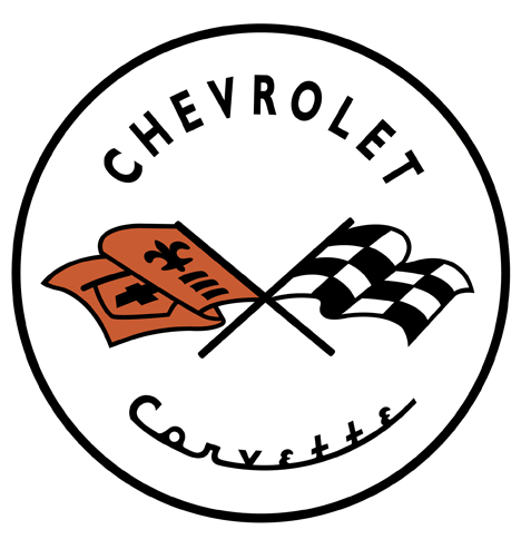
When Chevrolet was preparing their new Corvette sports car in the early '50s, the task of designing the logo fell to Chevy interior designer Robert Bartholomew. Bartholomew's design (above) featured two crossed flags: One, the checkered flag that symbolized race victory, the other, the American Stars 'n Stripes.
However, using the American flag to promote commercial products was illegal at the time, and Chevy execs reportedly decided at the last minute to nix that part of the design. (It's not clear why they waited until four days before the car's unveiling, but you can practically picture Bartholomew sitting at his drafting table going goddammit.) Bartholomew's last-minute replacement was a flag sporting both the Chevrolet logo and a fleur-de-lis, a French symbol that was reportedly part of Louis Chevrolet's family crest. (See our post on heraldry here.)

New badges were whipped up based on Bartholomew's drawings, and the Corvette debuted in 1953 at New York's Waldorf-Astoria hotel.

Sadly, after that story, all mention of specific designers associated with subsequent logos are nil. What we do know is that Bartholomew's design stuck around until 1957, then underwent multiple tweaks and changes throughout the years. Amassing a photo list has proved trickier than expected, as there were multiple emblems for the hood, tail and fenders, but we've tried to put together a visual chronology focused on the nose badges.
In 1956 and '57, a Chevrolet chevron was added to the design:

In 1958 we see a typographic update that persists until 1961:

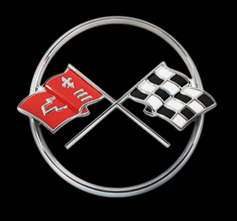
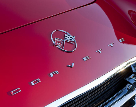
In 1962, the letters move outside the circle to the hood of the car:


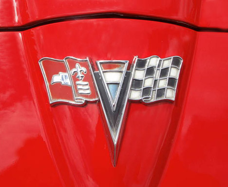
1963 sees an interesting change: The American flag is sort of snuck back into the logo, though the French would probably see a Tricolor. The circle is also dispensed with, as the logo is now shaped to follow the pointed "nose" of the new '63 body design.

In '65 the logo goes minimalist, dropping the fluff and keeping just the flags.

In 1967 the flags get an angle change, and the design remains the same until 1972:

In 1973 we see the first "sunburst" design. Once again typography is added to the periphery.

From 1975 to 1976, the letters are dropped again.

Though they look kind of cool now, these last two "sunburst" designs were an uncharacteristic and somewhat gaudy detour for the Corvette emblem. Perhaps it was a sign of '70s excess, and it was certainly very different from the minimalism of the logo of just ten years before. But next Chevy would move into more graphic-design-y territory, as you'll see in Part Two.
-
oFavorite This
-
Q5Comment
K
{Welcome
Create a Core77 Account
Already have an account? Sign In
By creating a Core77 account you confirm that you accept the Terms of Use
K
Reset Password
Please enter your email and we will send an email to reset your password.


Comments
My four year old son found this in the yard and I was wondering if anyone could tell me what year it’s from
'67
Anyway the cross can be seen very well in part II of the retrospective of Corvette's Logos.