8 Tips for Designing Windows Phone Apps + Lightning Design Reviews!

To help all of our App to the Future entrants create stunning designs, we've asked the Lightning Design Review team to send us their favorite tips for designing Windows Phone Apps. SIGNUP BY TUESDAY for the following Thursday's weekly Lighting Design Review! - core jr
Senior Interactive Designer Lincoln Anderson, who hosts the reviews, analyzed common issues he sees and shares his top eight design tips for Windows Phone.
1. FOCUS Write a "best-at" statement that clearly outlines what makes your app great and unique from the rest. Use it as a mission statement that guides design and development. Think about how different types of users will employ your app and focus on the top three "user scenarios" that truly support your best-at statement. Make these user experiences truly stellar before adding more features.
For reference: Windows Phone Design Process - Concept

2. PLAN Create a navigation flowchart, showing how the pages in your app interrelate. It will give you a clearer picture of how users should get around in your app. Group like pages and then decide if each group should be in panorama, pivot or app bar style based on how users will interact. Even if you're not artistically inclined, sketch simple wireframes for your pages and try different iterations. Sketches are always easier to modify than code.
For reference: Windows Phone Design Process - Structure

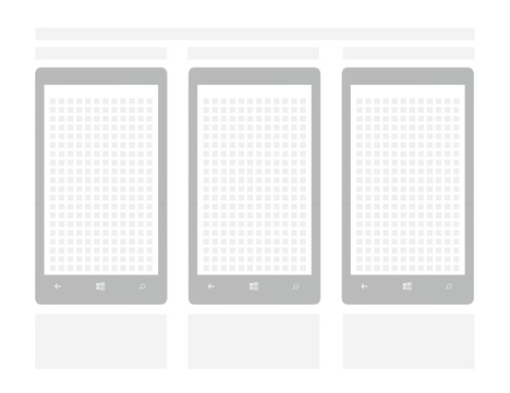
3. LOVE THE GRID Grid based design is nothing new, but did you know that Windows Phone has its own grid? Use it while sketching or creating design comps. There is even a handy overlay included in page template. (It's hidden in the XAML comments.) Flip it on and see the grid in your own application. Snap to it!
For reference: Sketch Templates

4. THEME IT One of the great things about Windows Phone is that users choose light or dark themes as well as personal accent colors. The entire phone takes on those themes. Don't let your app get left behind, or worse, perform opposite the user's intent. Theme and accent colors are available as resources you can use throughout your app.
For reference: Themes for Windows Phone

5. IT'S ALIVE Users love apps that feel like they're an organic part of their phone. Make a great live tile experience, even if that's not the main feature of your app. Live tiles pull users back into your app, and give you an edge over the competition. Take a look at the templates and come up with some ideas.
For reference: Tile Design Guidelines for Windows Phone

For reference: Windows Phone Design Principles: More with Less

7. BE INSPIRED Windows Phone's design language is inspired by International Typographic Style. This style focuses on strong typography, simplicity and clarity. It uses simple illustration, sharp contrast and bold shapes to communicate ideas effectively. Check it out, then spice up your app design.
For reference: Windows Phone Design Bootcamp 101: Windows Design Language

8. SELL IT Consider how you populate your store entry. This is often the first experience a potential customer has with your app. Your app's name and icon should be clear and memorable, its descriptions simple and effective. The screenshots you choose should demo key content and functionality that users want or need. Don't let a great app fall to the wayside due to lackluster marketing.
We hope you'll find these tips useful, and encourage you to share yours in the comments. To further your design education, here's a road map:
- Guidance from the Windows Phone design team
- Video series "Windows Phone Design Boot Camps"
- Get personalized tips for your app/design concept, with the Lightning Design Reviews
And finally don't forget about the Windows Phone App to the Future Design Challenge.
Even if you can't design your way out of a paper bag, but have great development skills, you can apply to team up with an App to the Future designer to build out a Windows Phone 8 application. Check the challenge page (at the bottom) to see how.
Read JC Cimetiere's original tips post on the Windows Phone Developer Blog.
-
oFavorite This
-
Q1Comment
K
{Welcome
Create a Core77 Account
Already have an account? Sign In
By creating a Core77 account you confirm that you accept the Terms of Use
K
Reset Password
Please enter your email and we will send an email to reset your password.


Comments