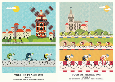
Crayonfire's Tour de France Posters

I'm not sure how much of our readership lies in the sweet spot at the intersection of graphic design and cycling fandom, but Crayonfire's Tour de France posters are a treat for those of you in either category.


The British graphic designer (also known as Neil Stevens) has seen fit to render each stage of the Tour in his signature colorful, geometric aesthetic. While his signature style might be considered reductive in the sense that he omits the sweat, tears and blood, the simplified shapes and vibrant palette don't detract from the sheer exertion and spirit of the competition. On the contrary, the posters are a handsome record of one of the most exciting Tours in recent memory.


I originally wanted to pick out a few of my favorites, but they're all so good that I couldn't choose (though I did, obviously, opt to resize some of them).


It's interesting to see how the images read at smaller sizes... not to mention the visual effect of the posters next to each other.


See them all here... or, if you're particularly enamored with all/any of them, buy them here.

via Prolly

Those of you who are more fact-inclined might prefer Jerome Daksiewicz's 2011 Tour de France infographic:

Another classic, for good measure:
-
oFavorite This
-
Q1Comment
K
{Welcome
Create a Core77 Account
Already have an account? Sign In
By creating a Core77 account you confirm that you accept the Terms of Use
K
Reset Password
Please enter your email and we will send an email to reset your password.

Comments