"Pure and Radical" Italian Design: Lancia's Stunning Pu+Ra HPE Concept Car
It blends '70s, '80s and '90s design cues with the 21st Century
Here's a gorgeous concept car with a strong identity, a clear design vision and a terrible name: The Lancia Pu+Ra HPE. (The "Pu+Ra" stands for "pure and radical," while "HPE" is "high performance electric.")


The tight lines and bold, minimal surfacing combine soft and sharp in the way that only Italian automotive designers seem to be able to pull off.


While the car is unmistakably a 21st-century design, there's also some wonderful throwback elements to previous decades and an earlier, indeed more pure, spirit that we so often see lacking in today's concepts. The gesture of the car evokes the type of renderings you'd see in '90s issues of Car Styling.


Remember the '80s, when industrial designers liked to randomly incorporate pure geometric shapes within non-geometric forms? The top view of the car, which features an electrochromic glass roof, reveals a dead-circular sunroof (I have no idea how it's meant to open):


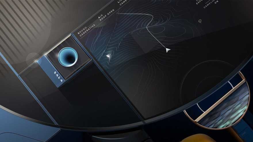
A second circle comprises the dashboard. In autonomous mode, it serves as a flat table; when a human takes over, the front half tilts down to become the instrument panel.


The circle motif is also echoed in the "tea table" between the seats (there's one both front and rear), meant "to elegantly convey the traditional cosiness of a home setting."


The louvered effect of the Venetian sunshade on the rear window also recalls the '80s:

The plush interior, meanwhile—done in partnership with Cassina--recalls '70s furniture.


The car looks even better in video than it does in the still shots:
Enter a caption (optional)
Lancia says the Pu+Ra HPE is meant to serve as their "manifesto for the next 10 years."
-
o1Favorite This
-
Q2Comment
K
{Welcome
Create a Core77 Account
Already have an account? Sign In
By creating a Core77 account you confirm that you accept the Terms of Use
K
Reset Password
Please enter your email and we will send an email to reset your password.


Comments
Seats: yes! Car seats: NO
Sign me up for one! Love the seats!