Redesigned Fire Extinguisher is Shaped Like a Steering Wheel, Worn Like a Shield
The Amplla Hussechuck, designed by an architect who survived a fire
After being caught in a building fire, and successfully fighting his way out using a fire extinguisher, Czech architect Premysl Kokes experienced a perspective shift. "When I now design buildings, I pay even more attention to firefighting technologies," he writes. During his harrowing experience, Kokes was able to locate a fire extinguisher in the burning building, but "they were well hidden," he writes.
Kokes doesn't say it directly, but from his text I'm parsing that he believes existing fire extinguishers are ugly and thus never at the forefront of a designer's mind, in terms of their placement and location. Kokes thus took it upon himself to redesign the extinguisher. "Tt is an attractive solution," he writes of his redesign, called the Amplla Hussechuck. "It can adapt to any interior and always remains in sight, always within reach."

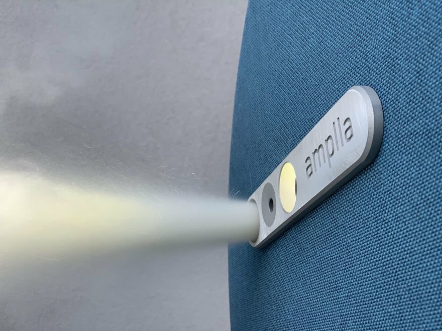
The form is startling. The Hussechuck is shaped like a steering wheel, rather than a gas cylinder. It's meant to be worn on one arm, like a shield. The nozzle is that little yellow circle in the image above.


Kokes has also designed two different fire-resistant shield covers for it. On the basic Shield, the only interruption in the surface is the nozzle aperture, which looks like a little peephole:


On the Shield Plus, the nozzle is joined by two more circles. One is the lens for a built-in flashlight. The other emits an acoustic alarm, to better help first responders locate you.


Here's a video showing how the thing is meant to be used:
Enter a caption (optional)
I'm not at all convinced this is an ergonomic improvement, but the motivation for Kokes' design was to make the object more attractive. I can't deny that he nailed that.


-
o2Favorite This
-
Q6Comment
K
{Welcome
Create a Core77 Account
Already have an account? Sign In
By creating a Core77 account you confirm that you accept the Terms of Use
K
Reset Password
Please enter your email and we will send an email to reset your password.


Comments
It's great that someone is looking at this product in a new way. And the idea of shielding yourself from fire as you move to an exit is brilliant.
But everyone knows the form of a fire extinguisher. In a real emergency someone may run right past this not realizing what it is. How do you re-educate people on such a massive scale to recognize alternative forms?
And is the common fire extinguisher really that much of an eye sore? We have white ones at home that I peeled the stickers off of and applied my own stickers. Now they're art!
Does this work for left handed people?
This is my biggest gripe with the design. If you look at where the trigger is you can see that it only works when held in the left hand. If you are missing that hand/arm, or have limited mobility, it's useless.
Nice looking, but I think the flashlight is too close to the nozzle, the spray will cause too much shadow. It would be better mounted on the opposite side.
Impressive. I thought this was just going to be a concept when I clicked on it!
It's beautiful for sure. In the video, and I get is a marketing video, he is way too close to the flames! How far does it shoot the extinguishing agent?