Mini's Designers Discuss Their Favorite Features of New Aceman EV Concept
A well-proportioned car with a shockingly garish interior
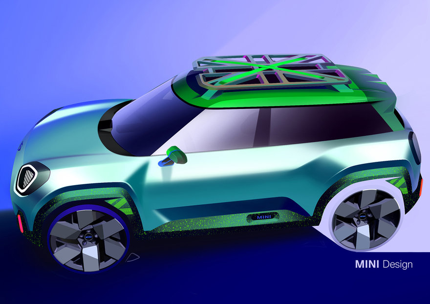
Mini has released images of their new Aceman concept, a well-proportioned EV with a shockingly garish interior. As has now become standard for many car brands, the reveal comes with plenty of shots from the design studio:


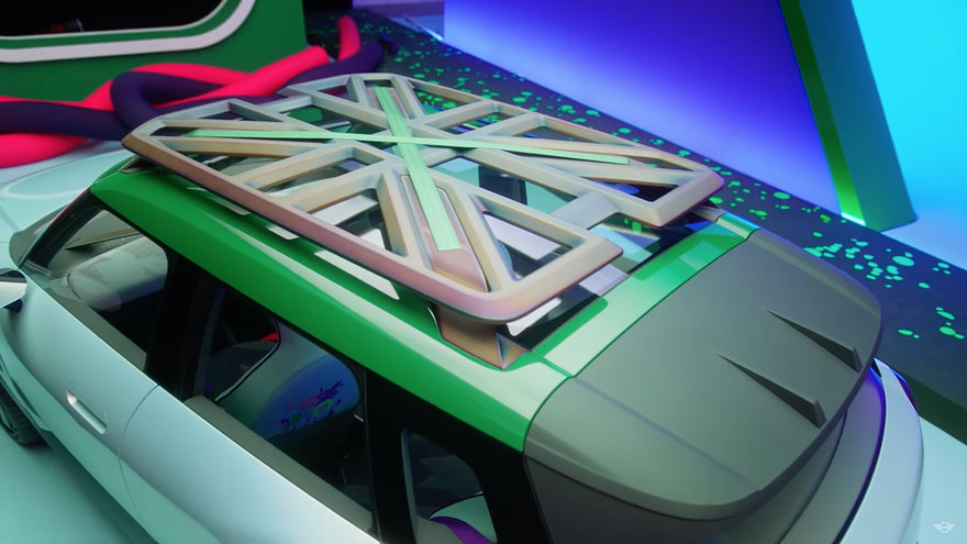
Crazy roof rack aside, I think the exterior proportions and lines look about right, and the company has dubbed the design language "Charismatic Simplicity." Here's how the physical model turned out:


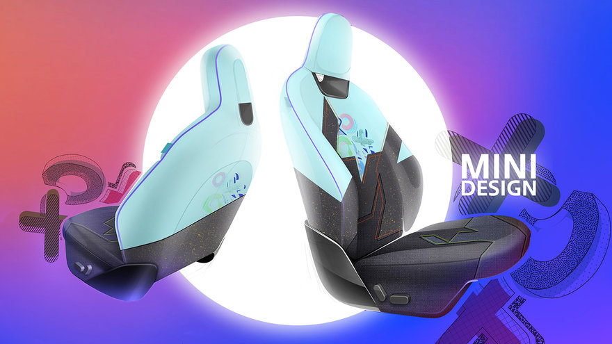
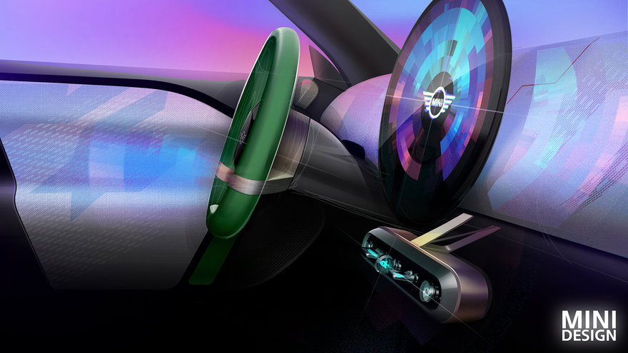
However, it's once we get to the interior that things go off the rails for me. The renders show you what they're going for:


And here's the physical execution:


I do admit I'd be highly curious to try a circular screen, though it doesn't seem to blend in very well with the dash. Then again, blending in is not the goal for this interior.
As for what they're going for, here Mini has their designers tell you about their favorite design features in the concept:
Enter a caption (optional)
I'm glad the designers were given free rein and allowed to explore, but man do I feel old.
-
oFavorite This
-
Q3Comment
K
{Welcome
Create a Core77 Account
Already have an account? Sign In
By creating a Core77 account you confirm that you accept the Terms of Use
K
Reset Password
Please enter your email and we will send an email to reset your password.


Comments
The video made me think of this: https://youtu.be/l2rEm7s3F4c
They still have those stupid brake lights that look like arrows pointing in.
80's are back baby!!!