Fantastic Transportation Design Student Work
Mingwei Liu's take on the Mitsubishi Lancer
I've often criticized the "modern" designs of cars that have lots of zig-zags and slashes across the bodywork. To me they feel like the designers are trying to do something "different" in the surfacing without regard for how those random, ill-advised character lines interact with the form.
So here I've got a more positive example of a freshly modern take on automotive design, one that demonstrates a clear grasp of form and ensures that all of the design elements work together. It comes from Mingwei Liu, done while he was a grad student at the Royal College of Art's Intelligent Mobility program, and is inspired by the Mitsubishi Lancer.
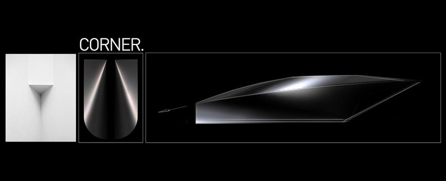
Liu starts with form studies, first establishing the overall gestures of the existing Lancer:


He then interprets those gestures, loosely, oversimplifying the form in an effort to get to its essence:

It's only after he's grasped the form, it seems to me, that he begins to experiment with new surfacing and tweak the proportions:


Finally, after all of the pushing and pulling, he's got his established gestures and character lines.

The simple white pencil sketch (below right) demonstraties Liu now has a clear grasp of all the surfaces and how they relate to each other.

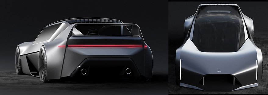
Then, he imagines the design wrought into sheet metal.


I think the end result looks fantastic, and that you can still see the Lancer DNA. I also appreciate that Liu "showed the work," so to speak, revealing that successful-looking designs like these aren't spun out of thin air, nor achieved by random scribbling, but come about through rigorous study, experimentation and careful attention paid to form.
Check out more of Liu's work on Instagram.
-
o2Favorite This
-
QComment
K
{Welcome
Create a Core77 Account
Already have an account? Sign In
By creating a Core77 account you confirm that you accept the Terms of Use
K
Reset Password
Please enter your email and we will send an email to reset your password.

