When a Seemingly Good Package Design Decision is the Wrong One
Color-coded milk bottle caps must go
Here's a seemingly good design decision that turned out to be a bad one. (And how two companies are trying to fix it.)
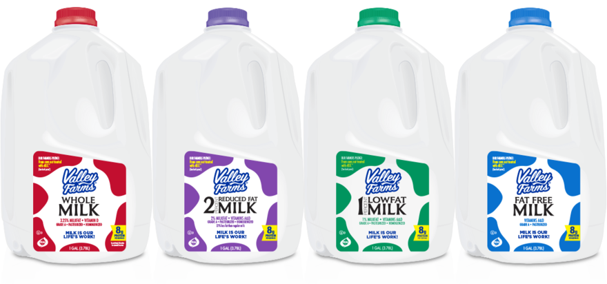
Imagine you're a purveyor of milk, and to meet market needs you sell four different varieties: Whole, 2%, 1% and skim. You tell your package designers to make it easier for the customer to distinguish between them on the shelf. The most obvious solution is to make it clear on the label, but imagine the harried parent with noisy kids in tow, trying to get the shopping done as quickly as possible, that won't take the time to read the label.
So the designers come up with a great idea: Color-coded caps. Red for whole, blue for 2%, green for 1% and yellow (sometimes purple) for skim. Most dairy producers and supermarkets have adopted the convention, or something like it.


Color-coding for distinction is Design 101, smart, right? At the point of purchase, yes. After the bottle's empty, no. While translucent milk bottles can be recycled into food-grade plastic packaging—rHDPE, or recycled high density polyethylene--the colored caps cannot. And right now, partially because plastics recycling is failing, there's more demand for rHDPE than there is supply.
British supermarket chain Waitrose reckons they can increase the supply of rHDPE by 1,560 tonnes (1,720 U.S. tons) simply by using clear HDPE milk bottle caps instead of colored. Thus they've partnered with British dairy provider Müller to produce milk bottles with clear caps.


It's such a small change—shoppers will just have to look at the labels for the colors now—but it really drives home how a seemingly smart design decision wasn't thought through carefully enough at the outset.
Of course, we're going to need a lot more fixes like this before the needle moves on our dismal recycling statistics.
-
o5Favorite This
-
Q9Comment
K
{Welcome
Create a Core77 Account
Already have an account? Sign In
By creating a Core77 account you confirm that you accept the Terms of Use
K
Reset Password
Please enter your email and we will send an email to reset your password.


Comments
It's worth noting that good design should never rely on color to differentiate choice. People with low or no vision or who are colorblind should be a considered, too. Designing with accessibility considerations creates better products for everyone.
How do paper and plastic labels effect recycling?
I think equalizing the cap colors would have a minimal impact on product selection. I tend to shop at varying grocery stores, depending on my fiscal restraints. Due to a lack of strict universal standards, colors will vary depending where I shop. I look for the label color first, then read the text to verify.
Why not go back to cartons for milk? I have been only purchasing whole milk in half gallon carton for years. Benefit of this is that it tastes better and it lasts longer thank the plastic container.
Great article! I agree that a recycle friendly label is sufficient. It's been pounded into my head since college that we need to think through products for their entire lifecycle. One of my professors was involved in a court case regarding a nuclear powerplant. His testimony pointed out the back end of a powerplant's lifecycle. That was in the 70's. Sadly, we're still waiting to figure that out.
Progress in action. Thanks for this.
Another misleading "clickbait" title. Making colored caps wasn't the "wrong" decision, it made sense at the time and solved a problem based on the info they had. I can promise we'll replace milk jugs with something better than plastic eventually and we shouldn't look back and say "what a stupid idea it was to use plastic for this packaging...." Hindsight is 20/20.
As a left-hander, I've noticed that the handle opening is larger on the side that would be gripped by right-handed people, which I've never understood.
Waitrose in the UK have been using the UK convention of Blue full fat, Green semi-skimmed and Red Skimmed. (This is different to the UK convention for foil caps on glass milk bottles: Silver full fat, Red semi-skimmed, Blue skimmed. )