Shape of New Luxury Condo Building is a Perfect Metaphor for Our Society
In the 19th century, we learned to create buildings using steel frames. These could soar well above buildings framed in the incumbent wood, brick or stone. And in the same century, elevator technology became practicable, so the masses wouldn't have to work out those quads going up endless stairs.
Architects were delighted. By 1889 we were seeing gigantic edifices like Burnham and Root's Rand McNally Building in Chicago:

By 1913, work had started on Ernest R. Graham's Equitable Building in Manhattan:

For some reason, the industrially powerful men who built the 20th century wanted things like blimps, submarines, cigars and skyscrapers to be as large as possible. But two enlightened fellows, New York City planners George McAneny and Edward M. Bassett, saw the danger. They realized that these monstrous monoliths of buildings, while great for architects' egos, weren't necessarily great for the individual human beings who had to live in their looming shadow.
Thus in 1916 McEnany and Bassett introduced the 1916 Zoning Resolution. This dictated that the height of buildings were tied to the width of the streets they faced. If architects wanted to keep building higher and higher, they'd have to introduce setbacks to compensate.
 Chart: Cmglee, CC BY-SA 4.0
In the 1920s Hugh Ferriss, an architect who specialized in renderings, began doing form studies of what these zoning regulations would mean for skyscrapers. Today we know this style as Art Deco.


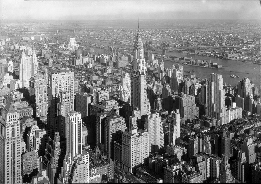
By the 1930s, architects having warmed up to the new rules, midtown Manhattan looked like this:

The setback skyscraper style provided some of our more iconic towers, like the Chrysler Building and the Empire State Building.
 Image: Tony Hisgett, CC BY 2.0
 Image: Sam Valadi, CC BY 2.0
In 1961 a new Zoning Resolution was passed in New York City. This resolution adjusted the Floor Area Ratio (FAR) of the lots and buildings to allow for bulkier edifices—as long as a plaza or similar open space was provided to offset the monolith. (For brevity's sake I am oversimplifying the actual rules; you can read more about them in detail here and here.)
Ironically, architects had already been doing just that, prior to the 1961 amendment. One could say that the setback style was already out, and the monolith style had returned, with Lever House by Skidmore, Owings and Merrill and the Seagram Building by Ludwig Mies van der Rohe, Philip Johnson, Ely Jacques Kahn, and Robert Allan Jacobs, both buildings having been designed and built in the 1950s.
 Image: Ken Ohyama, CC BY-SA 2.0
 Image: Beyond My Ken, CC BY-SA 4.0
What we didn't see, until recently, was architects completely reversing the idea of the setback skyscraper, turning it on its head, so to speak. But we're seeing it now. Witness Era, a new building of luxury condominiums now going up on the Upper West Side of Manhattan, designed by architecture firm ODA.


So why is it bigger on the top than the bottom?
Well, why do you think? Money.


Rich people want bigger apartments on higher floors. The design of Era provides more of those units in a way that's supposed to be visually interesting—and which, I think, is the perfect metaphor for a society where the rich dominate the poor. It doesn't seem sustainable, having that much wealth concentrated up top, it looks like the whole thing should come crashing down. But somehow they've figured out how to keep it going.

This design even allows for a rooftop pool. It's presumably filled with drinking water taken from the lower floors.
-
o4Favorite This
-
Q1Comment
K
{Welcome
Create a Core77 Account
Already have an account? Sign In
By creating a Core77 account you confirm that you accept the Terms of Use
K
Reset Password
Please enter your email and we will send an email to reset your password.

Comments
I'm here for the historical context + snarky take on our current seemingly unsustainable economic situation! More please.