Yea or Nay? Making Retrofittable, Tiny Desk Drawers in the Name of Organization
The Otis Rack is designed as an add-on to slab desks
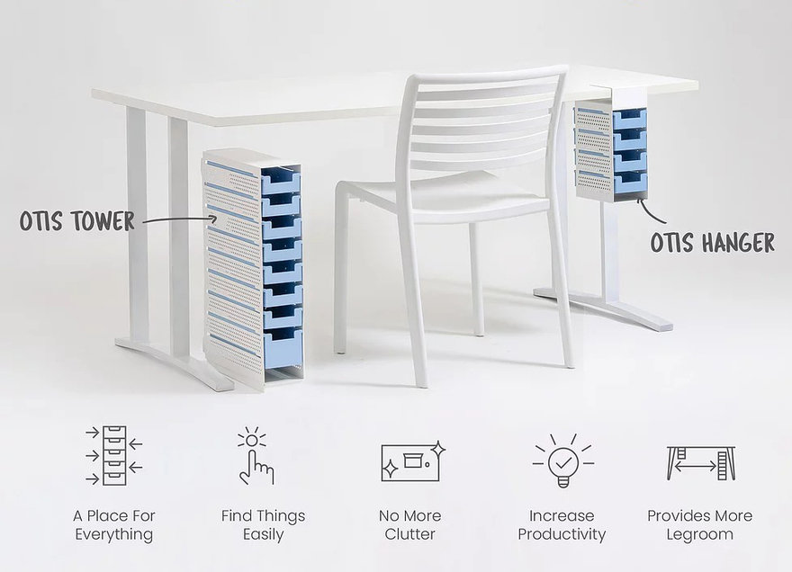
The trend in desk design has been to remove drawers, leaving us with featureless slabs. As people's desks grow more cluttered, the pendulum swings the other way and companies like Zenlet start designing desk-mounted accessories to hold all our crap. Another company in this category is a startup called Practiko, who's pitching their Otis Rack on Kickstarter. They reckon most drawers are too large, and figure it's better to go with multiple smaller drawers that have adjustable dividers within them.


I understand the thinking behind it, but this seems like one out of multiple concept mock-ups you go through to get to the finished design, rather than this being the finished design itself.

I think I'd constantly be knocking that tower over by accident. The hanging drawers make a little more sense, but something about the execution seems janky, like the proportions are not right.
What say you? Am I just holding a prejudiced notion of drawers, are these more in line with modern-day needs? (And yes, the project has been successfully backed.)
Enter a caption (optional)
-
o1Favorite This
-
Q3Comment
K
{Welcome
Create a Core77 Account
Already have an account? Sign In
By creating a Core77 account you confirm that you accept the Terms of Use
K
Reset Password
Please enter your email and we will send an email to reset your password.


Comments
I say yea, because previously desk drawer sizes were predetermined by file drawer size. Now that we seem to have actually become more paperless, smaller drawers make sense.
Love this post Rain and thanks for sharing your ideas. Thanks Ken and Jeff for chipping in as well. Our general idea behind this was to bring a more "tool box" type segmentation to the desk. Dedicated spaces for all your things. As we go into production there will most probably be some changes in order to make this product even better so all your thoughts and comments are very valuable to us. Please keep them coming!
Even though the overhang seems fairly deep I still see myself banging into the hanger with my knee every day, and dumping the lot on the floor semi-regularly.