Yea or Nay? Wrensilva's Retro Hi-Fi Stereo Consoles
Too "loud?"
Wrensilva is a California-based company that aims to create old-school hi-fi record-playing consoles featuring fresh, modern design.

I have mixed feelings about their aesthetic. The M1 is their flagship console, ringing in at 10 grand; they've also got a proportionally-scaled-down version called the Standard, which runs 8 grand. In the press photos they sent us, the two units are visually impossible to distinguish, so it's not clear which is which in the images below:


The designs look clean enough, but to me the choice of wood grain is simply too loud, and the finish too glossy. This is subjective, but I feel objects that play music should be about the music, and not about their own visual presence. While the forms couldn't be more different, philosophically speaking these remind me of those JBL Creature speakers from years ago; they seem to dare you to ignore them.

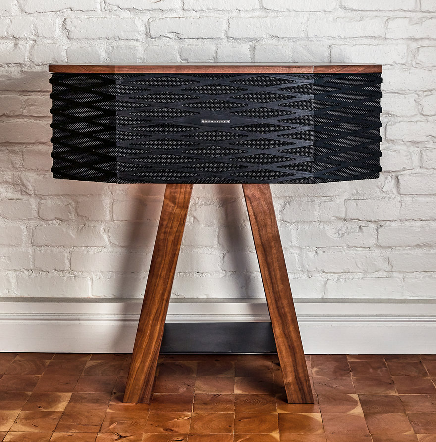
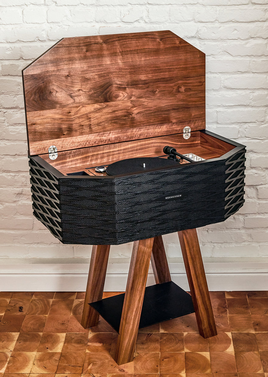
Wrensilva's latest offering is a more compact system called the Loft, which retails for five grand. This one really loses me:


The legs just don't make sense to me; what is the point of reducing the footprint when the console above takes up the width that it does? It needlessly cuts down on record storage space, and the splayed angle of the legs partially obscures the album cover. It also forces you to access the records from the side, requiring you to peer beneath the unit to see the spines of the records.


And in addition to the overpowering grain selection and sheen, the texture of the wraparound grille practically screams for attention.


What's your take on these?
-
oFavorite This
-
Q3Comment
K
{Welcome
Create a Core77 Account
Already have an account? Sign In
By creating a Core77 account you confirm that you accept the Terms of Use
K
Reset Password
Please enter your email and we will send an email to reset your password.


Comments
Take away everything the CNC rig did for them and you'll just have the sloppy miters and blotchy stain job left to judge the pieces by--neither of which read as "retro" or "modern." Even the most garishly veneered department store consoles of the 60s had more personality than this and they didn't come out looking like somebody's weekend project from Unpainted Huffhines that they wanted to finish before it rained. A little grain filler could have gone a long way.
Is the wrap around grill texture of the Loft a wood laminate too?
It looks like the platter of the Loft's turntable is also wood.
The gloss finish and highly figured wood It is very busy. Perhaps a matte finish or a wood with less contrast in its grain would calm down the design.
I also don't like the narrow footprint of the legs, it looks unstable and top heavy. The record storage also looks like an after thought and I agree would be very inconvenient to use.
I would rather see the form continue to create a cabinet below for record storage and that can sit on some shorter legs.