Design Criticism: Pentagram's Modular, Physical Signage System for the National Library of Luxembourg
More work for the workers, less legible for the patrons
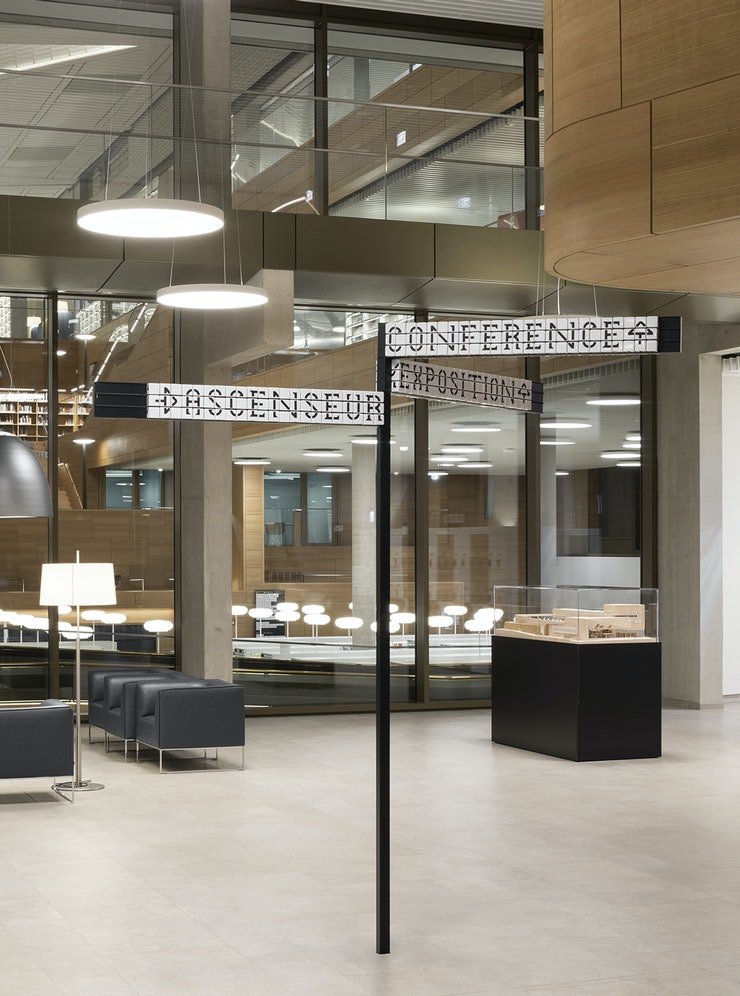
I understand that Pentagram is one of the world's most respected design firms, but to me this project perfectly highlights the disconnect between what fancy designers and regular people want. They've redesigned the interior signage for the Bibliothèque nationale du Luxembourg, a/k/a BnL, and "based [it] on a modular system that uses numerical and alphabetical cubes."

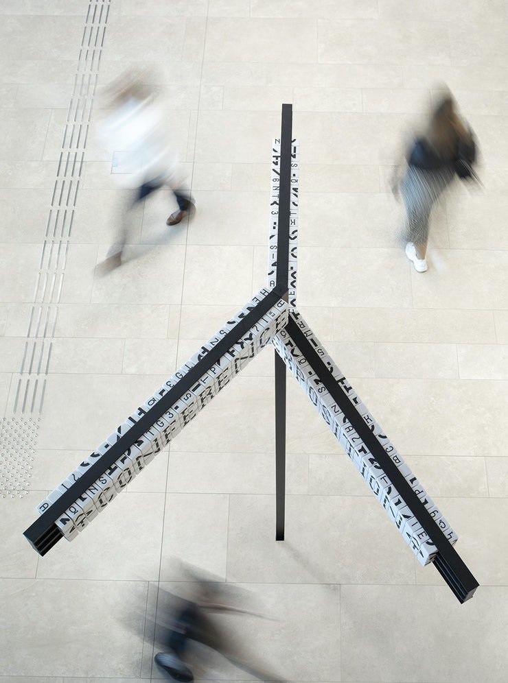
The flexible signage plan, consisting of 25,000 resin cubes, 6000 tableaus and 2,400 numerical shelving characters, enables staff to independently customize information as the library's collection fluctuates. The resin cubes, constructed from a durable material, also translate the timelessness of the library and its long-standing presence throughout the years and into the future.
The bespoke typeface Bibliothèque is designed in a series of four weights to meet the various needs of the library. The signage system consists of three character sizes including those set to the size of the cube itself for close to mid-range distances; large characters the size of a few cubes for long distance reading; and a reduced font size for shelving systems. The visual language appears in a minimalist palette of black and white with touches of red to create clear and coherent graphics.
First off, this means that library staff have to ascend ladders to assemble the cubes to spell out words. Ladders are the first no-no. If you look at OSHA stats, you could be forgiven for believing the sole purpose of a ladder is to send workers to hospitals. If you can design anything that reduces the need for ladders, that's a win.

Secondly, it takes six to nine cubes to make a single letter of the larger "long distance reading" characters. Look at how the letters are constructed, and you can see this is not a trivial undertaking.


So workers are supposed to go to the cube storage area of the library, then fish through, locate and identify the six to nine cubes required for each letter. Then they're meant to ascend the ladder and assemble this puzzle, cube by cube. That would have to make any employee long for an electronic sign that they can quickly and safely alter on the ground using some sort of device.

Thirdly, isn't a priority of signage that it be legible? It's true that my vision is worsening with age, but I can't be alone in thinking if you're designing a custom font for a library, high legibility should be a high priority.

In my opinion this redesign makes things harder, not easier, for both the library employees and the patrons. I think the sole party this design has been good for is the resin supplier and manufacturer hired to produce 25,000 cubes.
-
oFavorite This
-
Q1Comment
K
{Welcome
Create a Core77 Account
Already have an account? Sign In
By creating a Core77 account you confirm that you accept the Terms of Use
K
Reset Password
Please enter your email and we will send an email to reset your password.

Comments
Funny they created the large ones to be reconfigured; most of those never change unless the building is remodeled. Not like the W.C. or elevator are going to be in a different spot every month. Or how often does a library rearrange its collection that it would require them to climb a ladder and change a sign? So while I don't think these will be changed very often at all, I don't see the need to create a reconfigurable cube system for it. Just make a new sign if this happens. It's a bit too clever for the sake of being clever.