What Major Brands Have Their Own Fonts?
Goldman Sachs isn't alone in creating their own font. To avoid having to pay licensing fees, brand after brand has designed or commissioned their own. For example:
Apple

Designed in 2015, Apple's new-ish San Francisco font is on the physical keyboards of their products and, of course, iOS. The font was designed to be legible at small sizes, and there's a SF Compact variant designed for their watchOS.
BBC

While the UK's broadcast network needs a TV-friendly font, by 2017 they'd recognized the shift towards news consumption on smartphones. Their in-house designers created their Reith font to be clearly legible on both screen sizes. It's named for Lord Reith, the BBC's first Director General.


Google Fonts is a massive catalog of open-source typefaces. For their own branding, they created Product Sans in 2015, and for Android and Chrome OS they came up with the Roboto font, which is also open-sourced.
Netflix


Unsurprisingly, Netflix Sans was created to look "cinematic," according to It's Nice That, and of course has to pop on a display. Easter egg: The top of the lowercase "t" has a subtle curve meant to represent early, curved CinemaScope lens/screen set-ups.
Nokia


Nokia updated their relatively ancient Nokia Sans font (which dates back to 2001) with Nokia Pure in 2011. The latter font was designed for recognizability across a number of scripts (Latin, Chinese, Arabic, Greek, Hebrew, Thai, etc.) at a time when they still had a crack at the global market.
Samsung

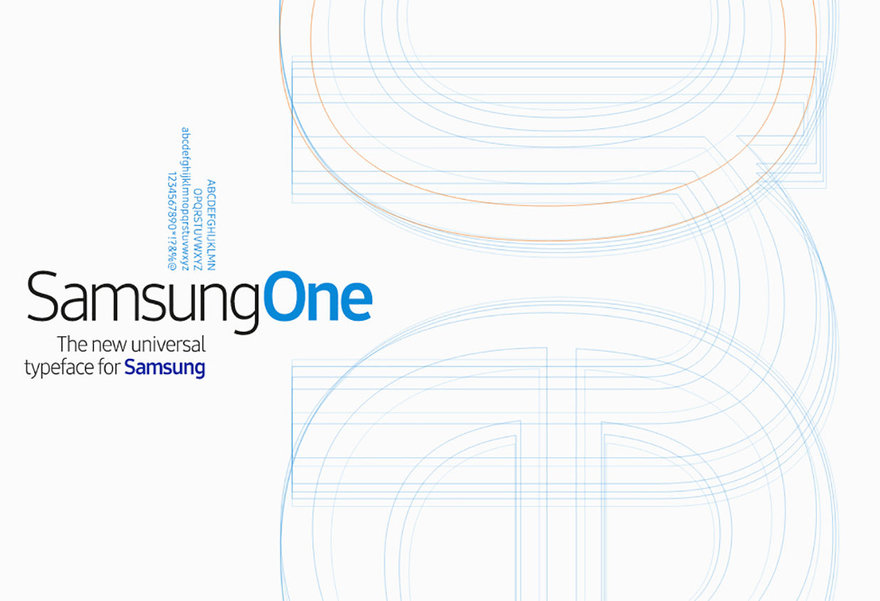
Samsung's SamsungOne font, also created around 2015, might be the most widespread, in terms of physical objects; as per the company's sprawling range, the font appears on everything from televisions to refrigerators to smartphones. (On the latter item, SamsungOne is used in place of Google's Roboto.)
USA Today


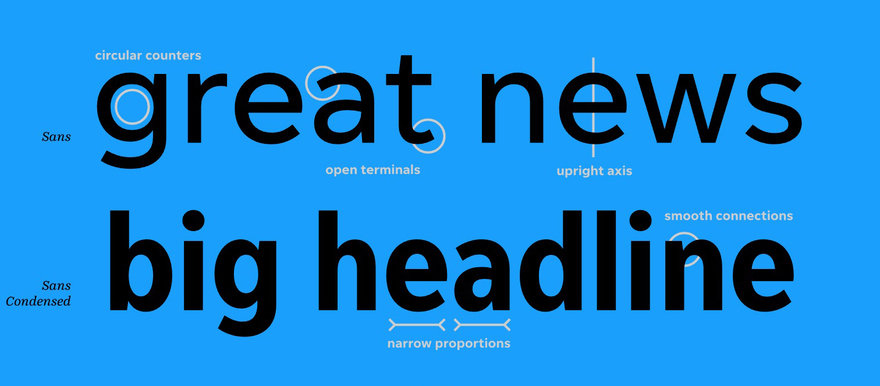
The daily newspaper has two fonts of their own: The modern, printed-newspaper-legible Unify Sans, as well as Unify Serif, the latter of which still provides that traditional newspaper-y look for bold pull quotes.
YouTube


YouTube Sans might be the only font on this list inspired by the company's own logo (the red "play" button). The angles atop some of the capital letters are meant to reference the triangle in the logo.
via Digital Arts
-
oFavorite This
-
Q2Comment
K
{Welcome
Create a Core77 Account
Already have an account? Sign In
By creating a Core77 account you confirm that you accept the Terms of Use
K
Reset Password
Please enter your email and we will send an email to reset your password.


Comments
Some countries also have a custom font for their national "brand", for example, the "Marianne" font in France : https://www.gouvernement.fr/charte/charte-graphique-les-fondamentaux/la-typographie
Airbnb has their own as well. https://airbnb.design/cereal/. Dalton Maag is kind of the go-to type foundry for this type of work over the past few years - https://www.daltonmaag.com/work