Here are more images of Coney Island: the distinct style of this graphical
wonderland speaks for itself... A few notes to help you understand perhaps the
context of this fantastic playland...
MIXED STYLES OF CONEY ISLAND
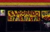 Eldorado Auto Skooter
A strange blend of the disco era and the cowboy Western. Keith Haring's artwork
is appropriated here beside crude illustrations of people in bumper cars. Coney
Island's seedy undercurrent is exemplified beautifully by Eldorado.
CORPORATE VERNACULAR ON CONEY
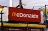 McDonald's
The corporate vernacular of McDonald's meets Coney vernacular. It is interesting
that the McDonald's style blended seamlessly into the concession stand dialect of
Coney Island. The fast-food chain appears less slick and modest in this setting
and uses its corporate colours, red and yellow, to full advantage. A
hand-painted mural on the left fits into Coney style completely with its festive
mood and emphasis on food. The front of McDonald's has been transformed from the
generic glass doors of its stand alone buildings into concession-stand generic
along the boardwalk on Coney.
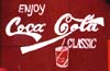 Coca-Cola
Whereas McDonald's blends itself into Coney Island, the locals took Coca-Cola and
adapted it into their own language. Here, Coca-Cola is hand-painted, and the
style is rough with a lot of personality. It adds a certain dynamic to a
well-known logo, and it still retains its corporate identity.
REFERENCES TO OLD CONEY
The vernacular of Coney Island also resonates with historicism. References to
the old Coney can be identified in the old-fashioned fonts and scrolls on signs.
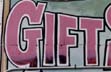 Gift Shop Sign
Imagery from the turn of the century is used liberally on this sign. From the
style of the illustration, it is clear the sign was not painted in the late
1800s, but the women depicted under the umbrella are clothed in the fashions of
that time period. The frame and the font used for "Souvenirs" are also from the
styles of that era. This was an attempt to appeal to the public's sense of
nostalgia. Novelty is also communicated by using old Coney imagery.
 Painting found on a Trailer
The painting is framed in a cross between circus vernacular and 19th-century
style.
Here, Coney is recalled as a colourful glow in the landscape, whereas
Manhattan is monochromatic and dark.
 Concession Stands
The dialect of concession stands is identified by its use and arrangement of
colour, type, and images and by its clutter. It is clear that the beach culture
has some influence on its style. The graphics are less aggressive than that of
stores on Surf Avenue; the colours blue and yellow dominate the scene rather than
red and orange, and the type and illustrations are drawn in Ô50's style (note the
hair style on the children !!).
 An illustration of the food being sold is almost always painted next to its name,
and styles range from realism to the cartoonish. Nonetheless, as mentioned
earlier, realism in paintings here usually fail, creating an abstract cartoonish
feel instead.
An illustration of the food being sold is almost always painted next to its name,
and styles range from realism to the cartoonish. Nonetheless, as mentioned
earlier, realism in paintings here usually fail, creating an abstract cartoonish
feel instead.
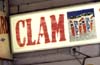
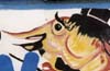
 Another interesting aspect of concession-stand language is the use of food as
characters. In the "clam bar," clams are depicted as bar patrons, and one of
them is even drunk. In the second photo, all the foods are dresssed up for a
cheerful parade to the concession stands. It is high Camp in the sense that it
exaggerates and it's artifical. But from my perspective, this sense of Camp is
completely attractive and fun !
Another interesting aspect of concession-stand language is the use of food as
characters. In the "clam bar," clams are depicted as bar patrons, and one of
them is even drunk. In the second photo, all the foods are dresssed up for a
cheerful parade to the concession stands. It is high Camp in the sense that it
exaggerates and it's artifical. But from my perspective, this sense of Camp is
completely attractive and fun !
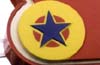
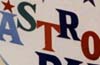 Amusement Parks
Amusement parks also use many of the bright colours seen in banner art and concession stands.
The Astroland Park logo implies the space age and the '50's.
 The speed of Tilt-A Whirl is conveyed in the logo by the horizontal lines behind
the type, and the whirling by the two circles on the edge of the sign. The image
of a clown is a favorite in amusement-park graphics because it conveys a sense of
Old World fun. The sign below the Wonder Wheel (which dates back to the '20s)
shows the charm of Coney Island's old glory days.
The speed of Tilt-A Whirl is conveyed in the logo by the horizontal lines behind
the type, and the whirling by the two circles on the edge of the sign. The image
of a clown is a favorite in amusement-park graphics because it conveys a sense of
Old World fun. The sign below the Wonder Wheel (which dates back to the '20s)
shows the charm of Coney Island's old glory days.
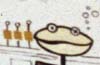
 The shooting galleries also employ the colour palette of Coney's system and use
the image of clowns heavily, conveying the feeling of silly fun. Many of the
signs are still hand-painted in the old style of shooting games, but the
merchandise (slum or flash) has changed to reflect pop culture. Note Pooh Bear
in the bottom photo.
The shooting galleries also employ the colour palette of Coney's system and use
the image of clowns heavily, conveying the feeling of silly fun. Many of the
signs are still hand-painted in the old style of shooting games, but the
merchandise (slum or flash) has changed to reflect pop culture. Note Pooh Bear
in the bottom photo.