 Coney Language
The architect of Luna Park, Frederic Thompson, believed that when designing a building for
a festive occasion, the architect must "dare to decorate a minaret with Renaissance detail or to
jumble Romanesque with l'art nouveau," creating buildings which "are as much a part of the
carnival spirit as the bands, flags, rides, and lights." The result was a delightful collection of
spontaneous, playful structures and signage.
The language of Coney Island is difficult to define because it is very free;
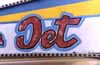 there is a strong
element of anything goes. One very distinctive element, however, is that almost all the signs are
hand-painted in a childish manner. Because most of the signs were painted by store owners
untrained in design or art, the finished pieces can appear cartoonish, even when the artist had
attempted a more realistic rendering. Although the intent of the signs is purely commercial, the
signs also convey friendliness and a peculiar honesty. This could be due to the slightly crude,
amateurish quality of most the artwork, which is a mixture of "the exaggerated, the fantastic, the
passionate, and the naive," qualities which Susan Sontag identifies
there is a strong
element of anything goes. One very distinctive element, however, is that almost all the signs are
hand-painted in a childish manner. Because most of the signs were painted by store owners
untrained in design or art, the finished pieces can appear cartoonish, even when the artist had
attempted a more realistic rendering. Although the intent of the signs is purely commercial, the
signs also convey friendliness and a peculiar honesty. This could be due to the slightly crude,
amateurish quality of most the artwork, which is a mixture of "the exaggerated, the fantastic, the
passionate, and the naive," qualities which Susan Sontag identifies
 as Camp. Further, she states
that "Camp taste nourishes itself on the love that has gone into certain objects and personal
styles." The Coney vernacular certainly has a playful, winsome vision of the world; the signs
lovingly preserve the history of Coney Island and appreciates "the little triumphs and awkward
intensities of 'character'."
as Camp. Further, she states
that "Camp taste nourishes itself on the love that has gone into certain objects and personal
styles." The Coney vernacular certainly has a playful, winsome vision of the world; the signs
lovingly preserve the history of Coney Island and appreciates "the little triumphs and awkward
intensities of 'character'."
Within the language of Coney there is an array of dialects: banner painting, concession
stand art, and amusement park art.