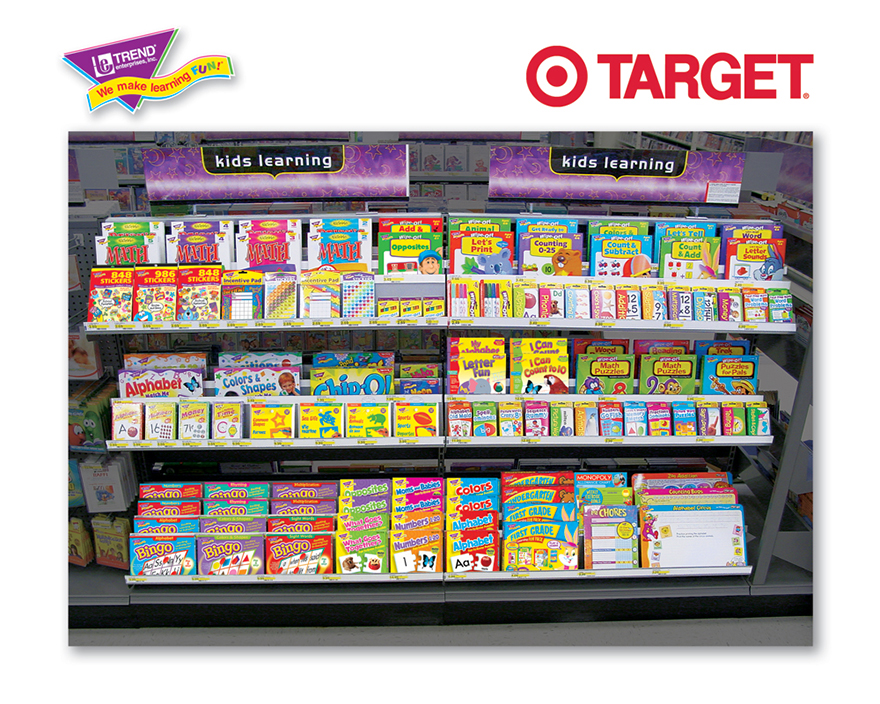
How Retailers Get Order from Chaos: Plan-O-Grams

Consider how broad industrial design is as a field: Maybe you designed the product that sits on a store shelf. Maybe you designed the box that the product sits in. Or heck, maybe you designed the actual shelves.
If you've done any of these things for a major retail client, you're probably familiar with what are called plan-o-grams, or POGs, or visual merchandising, or "shelf schematics," or whatever fancy jargon your client used for it. Plan-o-grams are that often un-fun but necessary breed of design work handed down by marketing gnomes, who emerge from their caves with The Data, sacred market-researched algorithms on "shelf presence." It's essentially a diagram of what object needs to go where in a retail display, with the ultimate goal of drawing customers into the store, increasing sales and "reinforcing brand." This eye-grabbing grid can be seen through the window and will draw the customer inside. Put this sparkly gewgaw at eye level so the consumer will spot it. Place these floor-demo items and waist level so the consumer will want to pick them up and touch them. Splash it with the company colors.
Back when I was on active duty, we designers had little to zero input on where individual items went, but were the ones tasked with graphically laying the diagrams out for printouts that were later given to the frontline retail employees. Sometimes late at night if you walk past, say, a closed Banana Republic or a Modell's, through the window you can see staffers setting up new displays and consulting binders filled with the latest diagrams.


These days there are specific software programs for marketers to lay out plan-o-grams on their own, and depending on what the product is a less-enlightened company might cut designers out of the process altogether.

There are also dedicated companies who serve as plan-o-gram consultants, and I'd like to believe that they hire design staff--preferably Coroflotters like David Myers and Michael Grogan, who've got plan-o-grams in their books.


There do seem to be some general unwritten rules with plan-o-grams. The space between items seems to directly correlate with the price of the items, i.e., cheaper stuff gets crammed together, pricier stuff gets to breathe.


Single-brand plan-o-grams of course try to communicate the brand through company colors, while occasionally mixing in an off-brand color to generate some visual "pop."

Retail clothing will strive to make displays attractive and enticing...

...whereas must-have items like hardware can jettison aesthetics in favor of sheer density. I believe the thinking goes that if you absolutely need a 5/8" box wrench or a 3" L-bracket, those aren't impulse buys and you're willing to dig through clutter to find it.

Multi-brand plan-o-grams—something laid out by a store chain that sells lots of different brands, like a supermarket—have to be the most thankless to execute. Trying to whip that amount of discordance into visual order is a challenging task, yet I doubt that any shopper thinks "Wow, I wonder who laid all of this product out? I'd sure like to tip my hat to them!"

-
o1Favorite This
-
Q6Comment
K
{Welcome
Create a Core77 Account
Already have an account? Sign In
By creating a Core77 account you confirm that you accept the Terms of Use
K
Reset Password
Please enter your email and we will send an email to reset your password.


Comments
Excellent post! Good to see some exposure to the little known and rarely celebrated offshoots of ID that some of us live and breathe. POGs are truly mind-numbing and soul-crushing tasks, but there are a select few out there who love it and are hardwired in just the right way to dive into this field and make a solid career out of it.
Love these posts!
The real fun presented itself when there were different floor plans that needed adjustment. This particular company tried to limit the floor plans that they used, but I think they still had 8 variations that could change the shelf space allotted.