Organizing the Year: Designing Calendars and Planners

Digital calendars are everywhere now—but many end-users still prefer to use paper. Calendars like the one above are attractive, but not really functional; there's nowhere to note what's happening on any given day. Fortunately, designers have created a range of calendars and planners that do help end-users keep track of their time commitments.

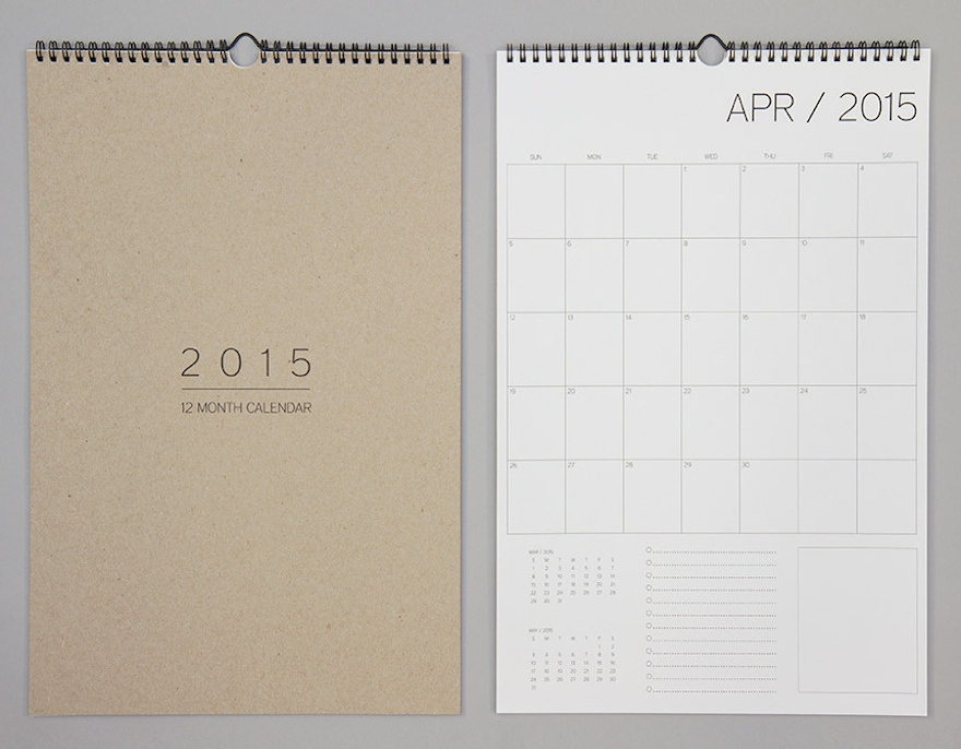
While many wall calendars have illustrations, REDSTAR Ink provides a wall calendar with just the essentials: good-sized blocks for writing in each day's activities. The calendar measures 11 inches by 17 inches, and is printed on heavy recycled stock with a recycled chipboard cover.

Letter C Design prints this calendar on individual sheets of recycled kraft text paper, which allows multiple pages to be displayed at once. Each page could be mounted to the wall using a clipboard, added to a 3-ring binder using a sheet protector, pinned to a bulletin board, added to the refrigerator door (with magnets to hold it in place), etc.

Sometimes end-users with lots of wall space like to see the whole year at a glance, and designers have created calendars to address this preference. This one, from Crispin Finn, has one row for each month. It measures 99.7cm × 70cm (39.2 inches by 27.6 inches). "Popular observances" such as East Sunday and Bonfire Night have been noted—which will be useful to the U.K. audience, but maybe not to those from other countries. Deciding which holidays to include will always be a design issue for those creating calendars and planners.

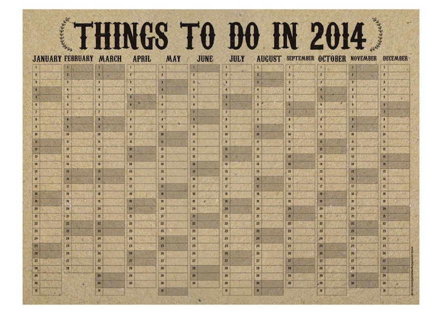
Something New Stationery uses a different design for its wall planner, with one column for each month. It's smaller than the Crispin Finn calendar, measuring 420mm by 594mm (16.5 inches by 23.3 inches). The weekends are shaded in gray, which is a nice touch; it's easier on the eyes, and makes it a bit quicker to figure out where you are within the month.

A full-year wall calendar could also be laid out as a series of months, as with this dry erase calendar from Decals Murals. The end-user will need to add the dates to this calendar, which is a small annoyance—but the calendar is reusable, which is nice from both an economic and an ecological standpoint. The calendar measures 26 inches by 45 inches.

NeuYear shows us yet another way to design a full-year calendar, using a monthly calendar layout but running the months together into a continuous flow. NewYear calendars have a horizontal orientation on one side and a vertical orientation on the other side, providing end-users with two choices for fitting the calendar into their spaces. Both paper and dry erase options are provided. The calendar measure 27 inches by 39 inches.

For those designing agendas or planners, page layout becomes a major consideration. The planner could be designed around a day view, a week view, or a month view. And once the major view is chosen, there are still numerous ways to handle the layout. Here's one weekly version, from Rhodia. Unlike many planners, this one gives each day equal space, rather than making weekend days smaller. Each day has time slots from 7 a.m. until 8 p.m., which might be too limiting for those with less traditional work schedules, or evening plans. The right-hand page for each week provides a space for taking notes.

This weekly planner from Smythson takes a very different approach, with simple empty blocks for each day of the week and one block for notes. The little full-month calendar at the bottom of the memoranda section is something end-users are likely to find helpful.

Two other major design question remain for these paper planners: How large should they be, and how many (and which) non-calendar pages should they include? Some end-users will want their planners to be all-in-one resources, where they keep their addresses and phone numbers, their to-do lists, their meeting notes, etc. Others will want just a planner—and there are all sorts of variations between these two extremes. Systems such as the Circa smartPlanner allow the end-users to select which additional pages they want.

Moleskine has a clever design with its "Colour a Month" daily planner, which allows end-users to carry only the months they need at any given time of the year.

Designers who understand the needs of a specific group of end-users can create planners tailored to those users. This academic planner was designed by a mother who understood what her child (and other children) needed to ensure assignments got done, weekly workload was managed, tests were not surprises, etc.

Another targeted planner is the momAgenda, created for mothers who need to keep track of activities for multiple family members. While marketed to moms, this could easily have been called the parentAgenda, since fathers could use this just as well as mothers.
-
o1Favorite This
-
Q1Comment
K
{Welcome
Create a Core77 Account
Already have an account? Sign In
By creating a Core77 account you confirm that you accept the Terms of Use
K
Reset Password
Please enter your email and we will send an email to reset your password.


Comments
Great work