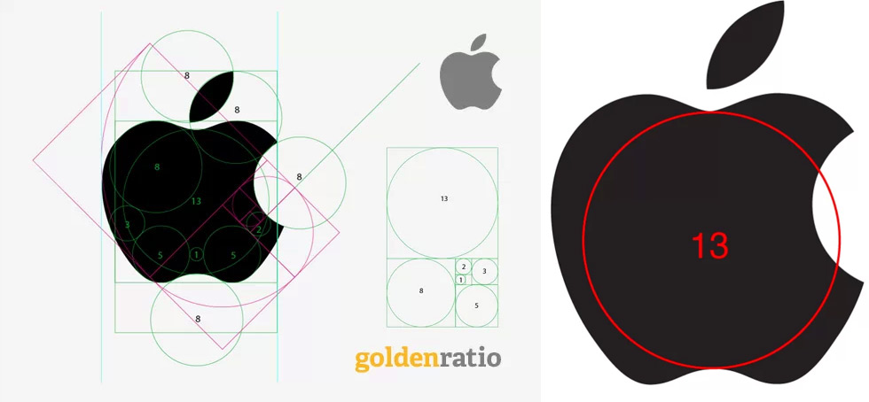
Quora's David Cole Settles the Apple Logo / Golden Ratio Issue Once and For All

While I understand the appeal of the golden ratio as a rational approach to aesthetics most people would probably agree that it's impossible to reduce beauty to a series of numeric relationships. Yet the myth persists, and it should come as no surprise that these putatively ideal proportions might hypothetically inform graphic design as well—after all, the very premise of digital software is to allow us to create vector images with mathematically unerring accuracy.
And of all the countless logos that we see on a daily basis, Apple's ideogrammatic fruit is a leading candidate for a hypothetically golden (or hypothetically rational, as it were) logomark. Fed up with the conjecture, Quora's David Cole recently decided to investigate. We won't ruin it for you, but it's a fascinating read, not least for Cole's highly systematic approach.

(Pseudo-spoiler alert, Cole ultimately cites Helvetica as a canonical case of optical appeal over geometry: "...real visual rhythm is hurt by precision. This fact is where we get the saying in design: if it looks right, it is right.")
Somewhat related (or at least obliquely relevant) if you're into this sort of thing: recent Art Center grad Andrew Kim reports from his meeting with the one and only Dieter Rams.
Hat-tip to Jayna Wallace-
oFavorite This
-
QComment
K
{Welcome
Create a Core77 Account
Already have an account? Sign In
By creating a Core77 account you confirm that you accept the Terms of Use
K
Reset Password
Please enter your email and we will send an email to reset your password.

