Data Cuisine Lets You Have Your Data and Eat It, Too
 "Take it with a Pinch of Salt!" (a dish exploring the street noise levels in Barcelona throughout the day)
Last week, BoingBoing picked up on a TL;DR study that validated the value of artistic presentation... when it comes to salad. A team of psychologists from Oxford recently published the finding that thoughtful plating goes a long way towards enhancing the overall perception of the dining experience. In short, if it looks good, we're more likely to think that it tastes good too (and that it's worth a few extra pounds—sterling, that is).
Gathering data on our cultural misconceptions is one thing; presenting it is another thing entirely—but it so happens that a couple of designers have undertaken this very task. In an (unrelated) inversion of the Oxford experiment, Data Cuisine is a research project in which socioeconomic data is presented as culinary visual- and gastronom-izations. Whereas the psychologists tested the eaters with an edible Kandinsky, Susanne Jaschko and Moritz Stefaner lead workshop participants in translating data sets into recipes: "Have you ever tried to imagine how a fish soup tastes whose recipe is based on publicly available local fishing data? Or what a pizza would be like if it was based on Helsinki's population mix? Data Cuisine explores food as a means of data expression—or, if you like—edible diagrams."
 "Age & Language in Lentils" (a visualization of the median age, population sizes and languages spoken in the USA and Italy)
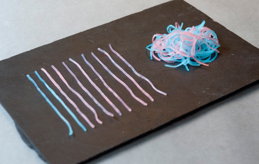
 "First Date Noodles" (a look at the number of people who will have sex on a first date)
So far, there have only been two workshops (one in Helsinki and one in Barcelona), but the plates that they've posted to the website have proved thought-provoking. For example, the noodle arrangement pictured above, titled "First Date Noodles." The tangled ball of noodles represents the number of men and women (denoted by pink and blue noodles) who will have sex on a first date—59 percent of women and 86 percent of men, based on an informal survey among the cooks' Facebook acquaintances. The outlying noodles represent those who abstain.
 Emigration Fish" (a dish representing the number of young people who emigrate from Spain)
 "Requiem for Science" (a representation of the decrease in Spain's science funding)
Other projects represent visualizations of the homeless population in Barcelona, Finland's annual berry yield, the state of well-being in Spain and alcohol consumption throughout Finland, to name a few.
 "Kippis!" (a map of Finland representing the differences in alcohol consumption cross-country)
 "Tortilla Feliz Catalana" (a dish visualizing the state of well-being in Spain)
Beyond the appetizing visual presentation of these data sets, some of the dishes even incorporate regional flavors as a kind of gastronomic 'geotagging,' such that diners can actually taste the difference between data points. While Data Cuisine is an elaborate and not entirely precise way to present information, these edifying entrées certainly represent a novel way to consume both data and dinner.
You can check out more of these food designs here.
 "Unemployed Pan con Tomate" (a chart showing the increase in Spain's youth unemployment)
Via Design Taxi
-
oFavorite This
-
QComment
K
{Welcome
Create a Core77 Account
Already have an account? Sign In
By creating a Core77 account you confirm that you accept the Terms of Use
K
Reset Password
Please enter your email and we will send an email to reset your password.

